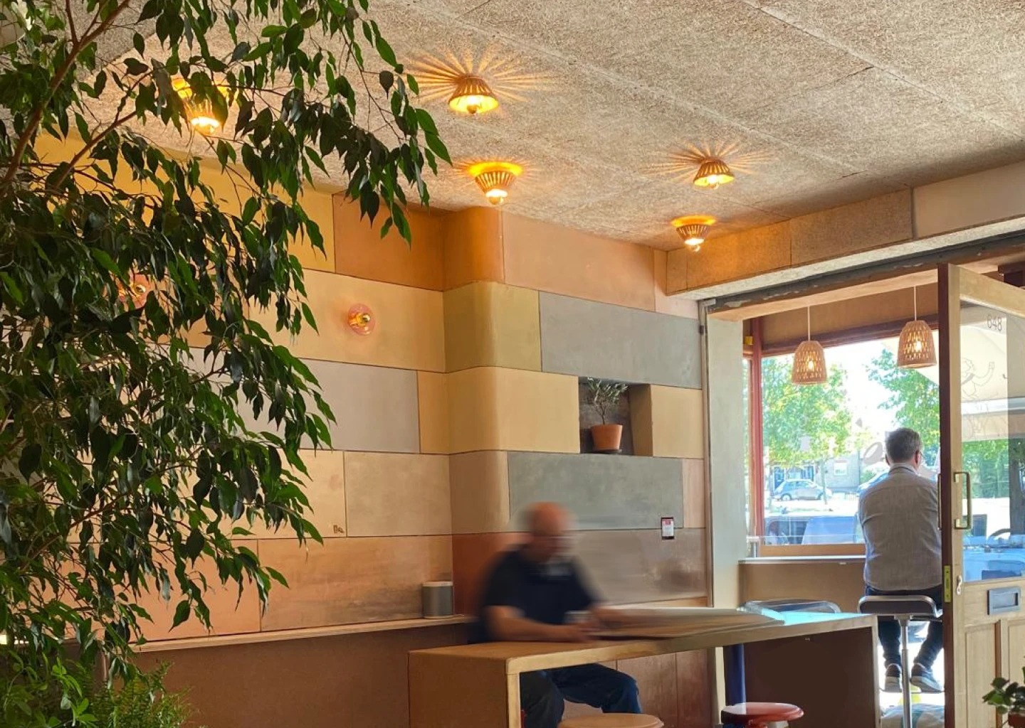
That line is the brand's own campaign copy, and it's a fair summary of the whole project. Clay & Bean is an independent coffee shop in Woodford Green, London — a passion project its owners built with their own hands, panel by panel, in clay plaster and natural materials. The identity had to match that: a logo built from a plastering trowel and a coffee bean, and an illustration system that makes room for everyone in the neighbourhood.
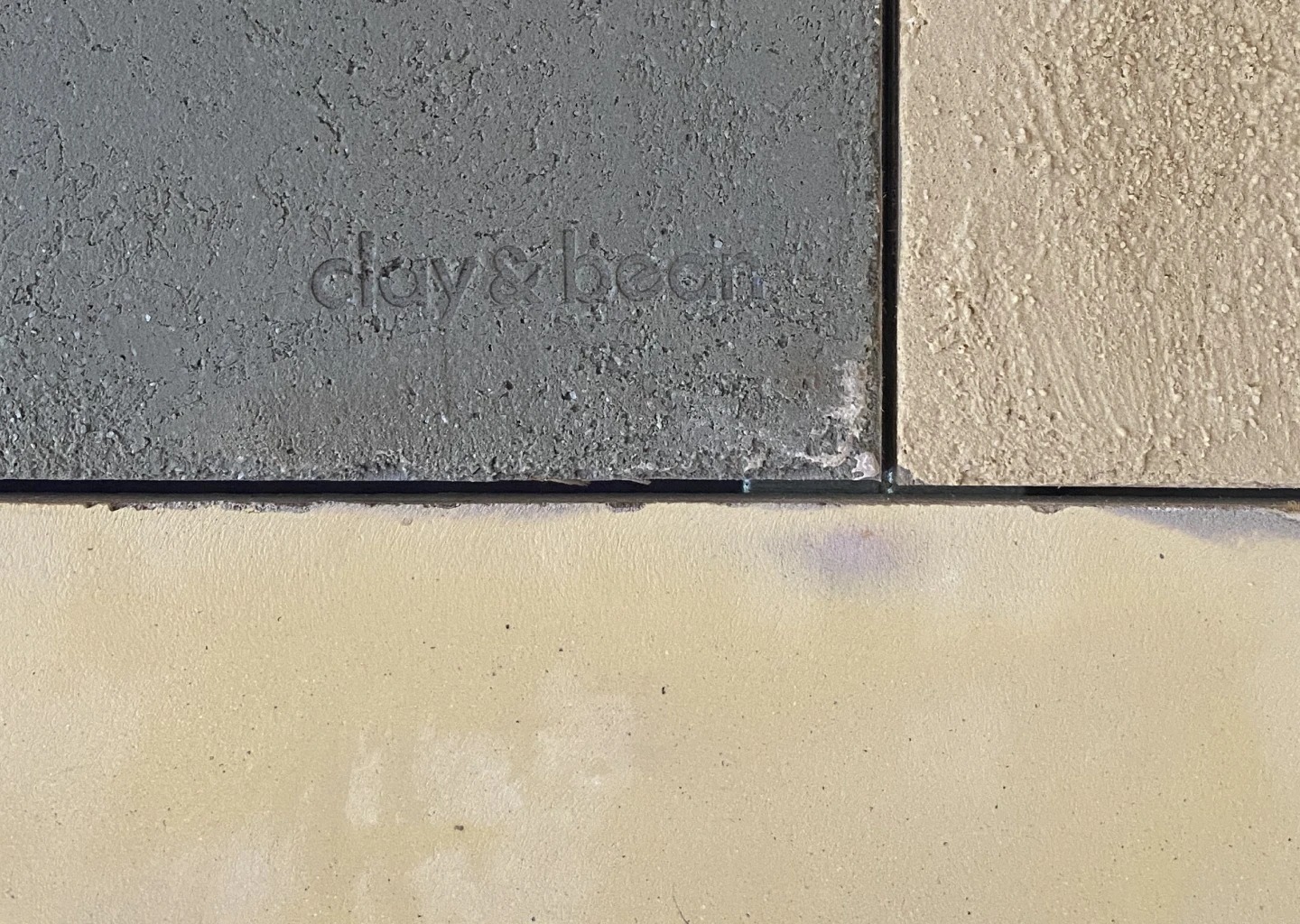
Clay & Bean started as a passion project. The people behind it also run Recraft, an interior crafts and refab construction company — I had designed Recraft's visual identity and direction earlier, and this project came to me through that collaboration. They didn't hire someone to fit out their coffee shop. They built it themselves: every wall panel hand-shaped in clay plaster, natural and partly reused materials throughout.
From the first conversation it was clear this wasn't a simple coffee shop. It runs in two directions at once: a place for the community, and something close to a showroom for the aesthetic of the clay panels themselves. What they asked of me, in essence, was to make it read the way it feels — a coffee shop with soul.
A place like this can't carry a generic coffee brand. Cold minimalism would contradict the hand-shaped walls; a loud, trendy identity would drown them out. The brand had to hold the same qualities as the space: craft, warmth, and restraint.
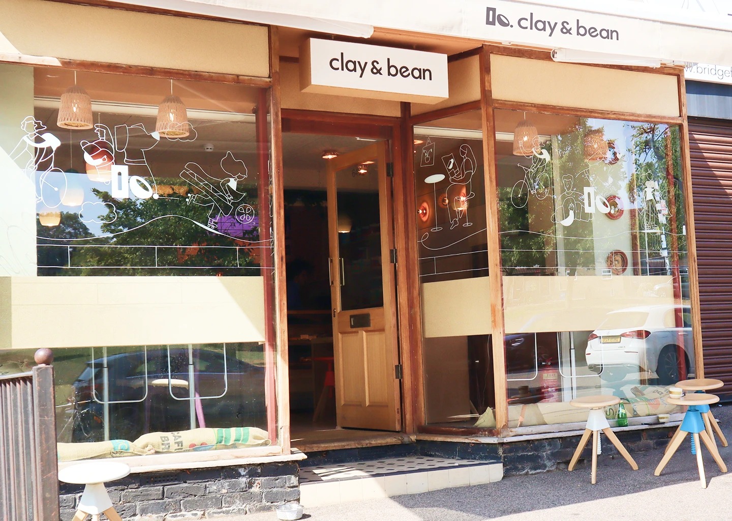
And it had to say — without words — that everyone is welcome. The neighbourhood around the shop is exactly that mix: people arriving by bike, people with dogs, people in a hurry grabbing a coffee and leaving. The identity needed to put those people in the brand, and it needed to work hard on one particular surface: the shop's own windows.
The strategy had two halves. The logo takes the craft route: it's drawn from the actual tools and materials that built the place, combined with a minimal construction so it stays quiet and confident. The community takes the illustrated route: a cast of line-drawn characters — the regulars, essentially — carrying the welcome across every surface the brand touches.
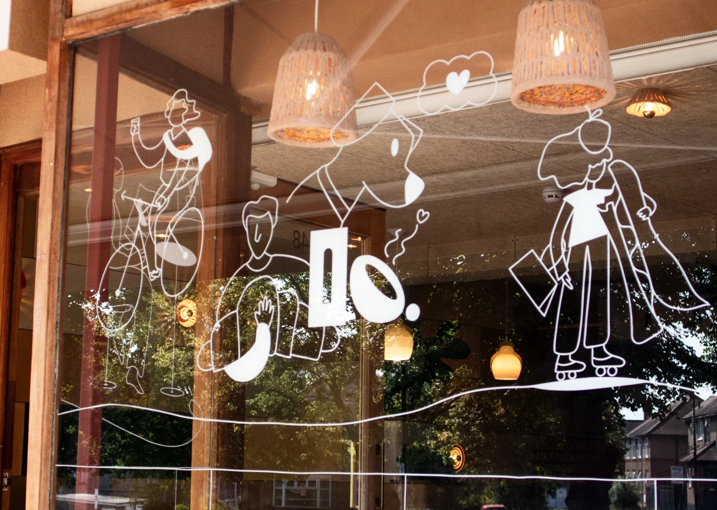
The window illustrations were the key move. The shop sits on a busy corner, and the glass was the perfect opportunity to communicate the intention of the place: you see the biker, the dog, the skater, someone rushing off with a cup — and you understand who this place is for before you've read a word.
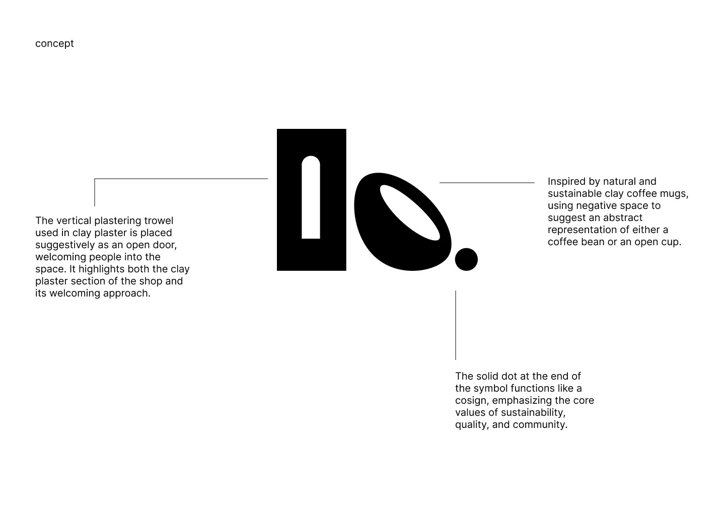
The first form in the logo is the vertical plastering trowel used to work clay plaster — the tool that literally shaped the walls. It's placed so it also reads as an open door, welcoming people in. Next to it sits a negative-space form somewhere between a coffee bean and a handle-less cup, the kind you hold with both hands. The solid dot at the end works like a cosign under the shop's values: sustainability, quality, community. Craft in the content, minimal in the construction — the two halves of the place, in one mark.
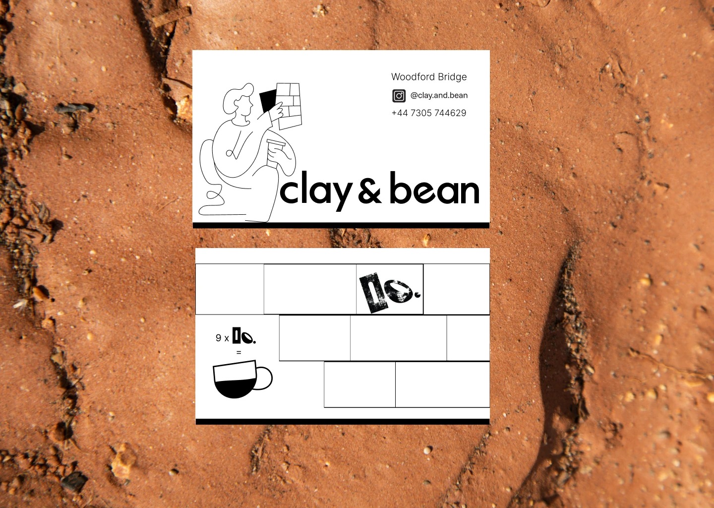
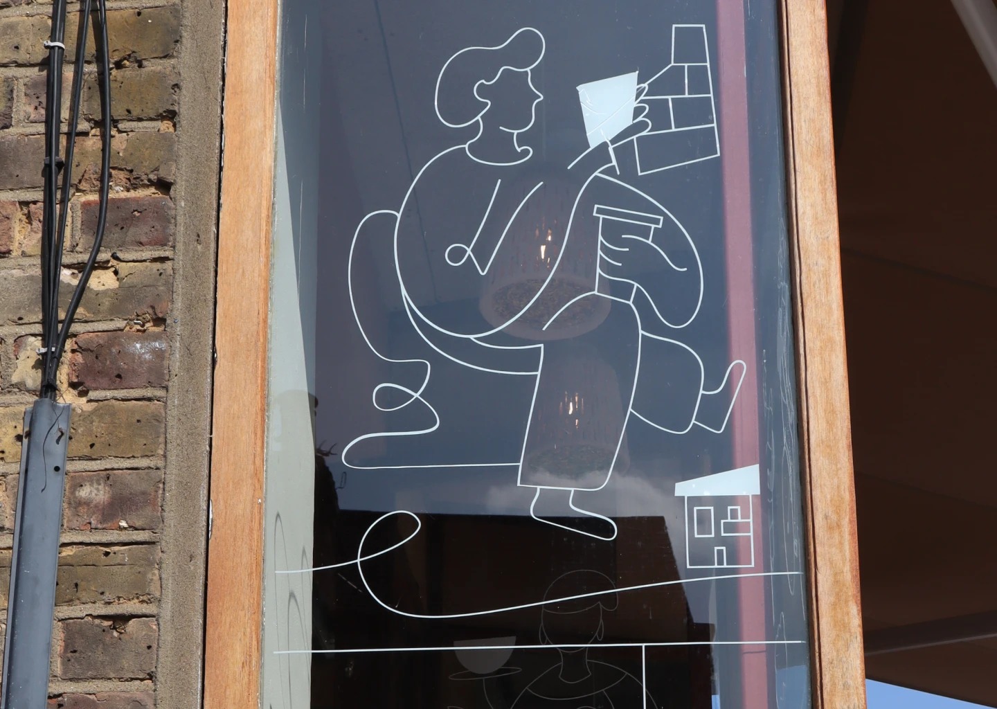
The illustration system is a cast of characters drawn from the street outside: the person on the bike, the dog, the rollerskater, the one hurrying off with a takeaway cup. One continuous line, no colour, no noise — so they sit comfortably on the clay tones without competing. They run across the window vinyls, the wrapping paper, the menus and the merchandise, and they all say the same thing: whoever you are, whatever context you arrive in, you're welcome here.
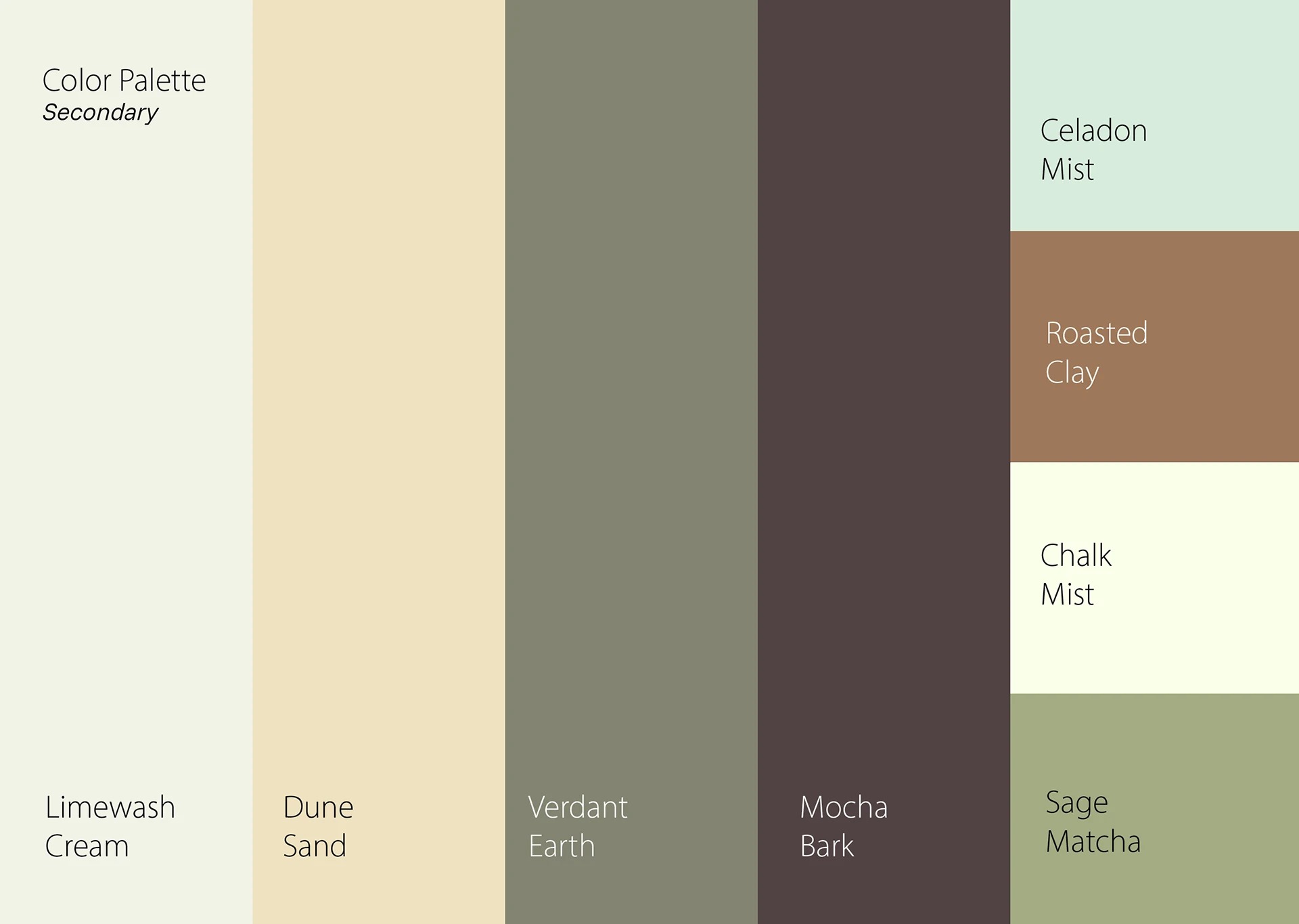
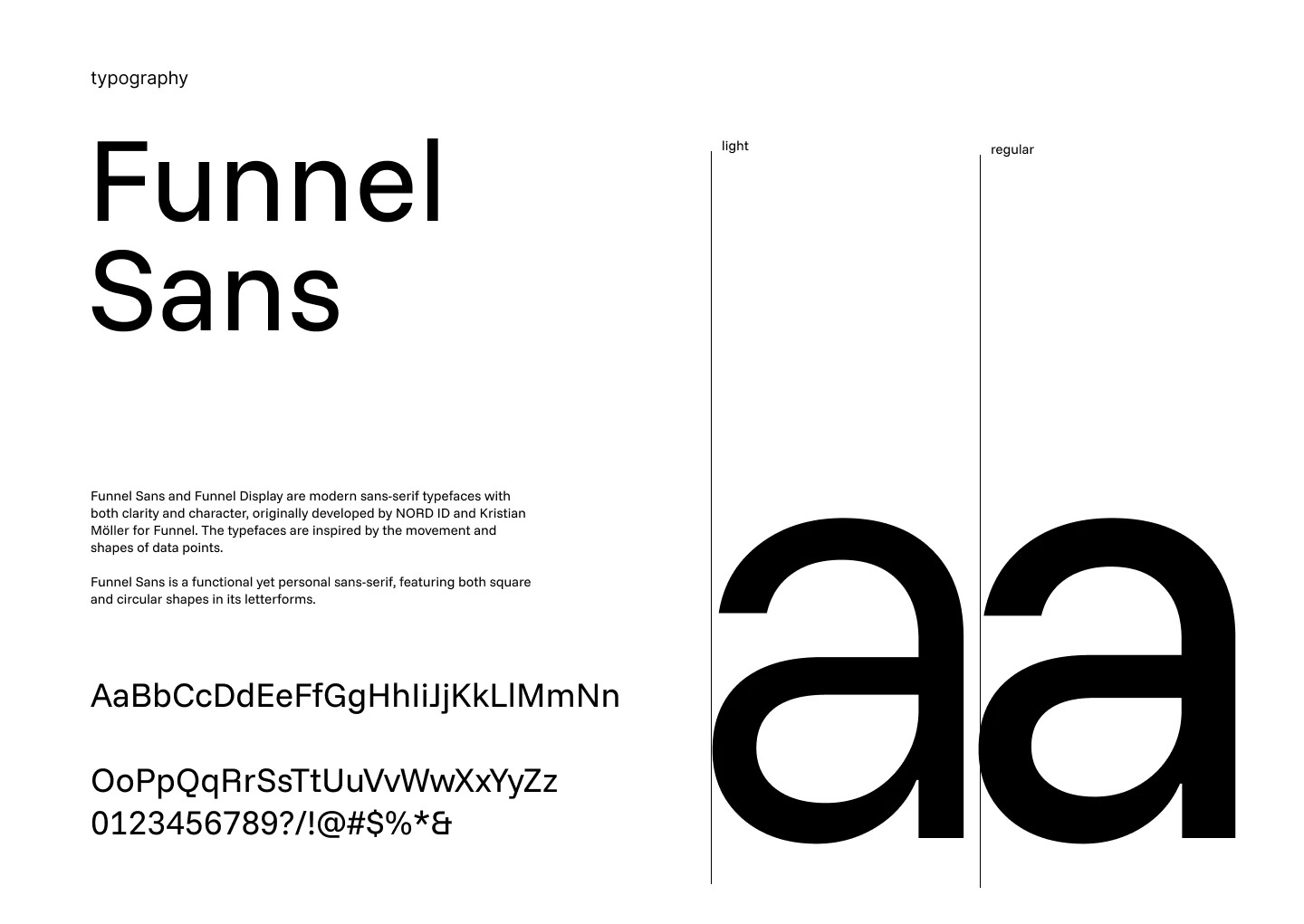
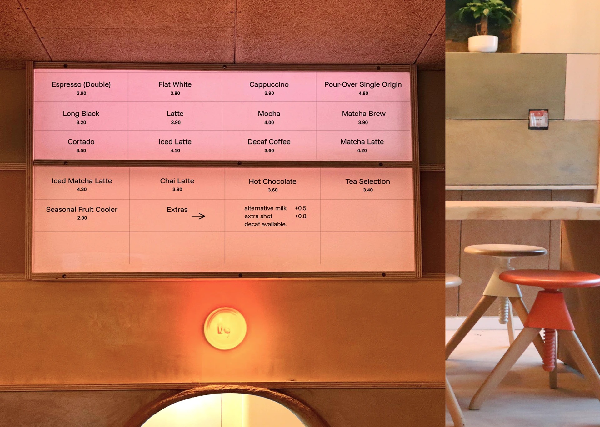
The palette is named after what's physically in the room: Limewash Cream, Dune Sand, Verdant Earth, Mocha Bark, Roasted Clay, Sage Matcha. With the symbol and the illustrations carrying the expression, the typography didn't need to shout — it needed personality and character at a lower volume. Funnel Sans does that: a functional sans-serif with both square and circular shapes in its letterforms, which is exactly the balance the logo strikes too. The system runs through menus, cups, bags, aprons and signage without ever feeling branded-at-you.
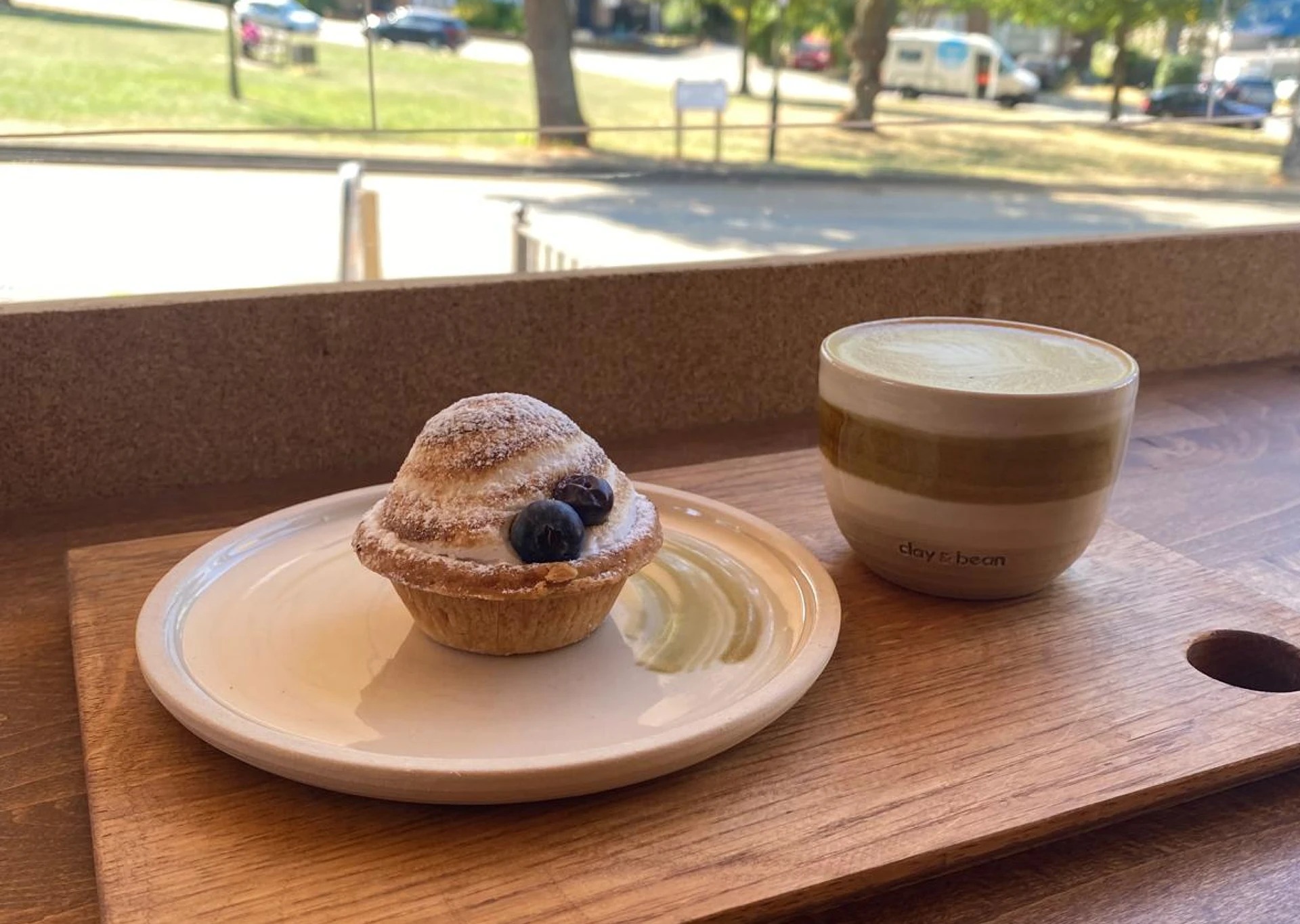
What shows in those reviews is the thing the brief asked for from the start: people can tell the place was made with soul — down to the ceramic cups in natural clay, made by by.noo.ceramics. David's own words, after the work: "She took the time to understand our vision, values and personality, and transformed them into a visual identity that tells our story."
The owners shaped every panel of this place with their own hands. The identity's job was to make that visible before you even open the door.
I take on a small number of strategy & identity engagements for companies in fintech, medtech and civic tech — and the occasional consumer brand with soul.