Engine Capital's founder had already written the promise — powered finance, accelerated lending — before I arrived. What he didn't have was a mark or a system that could make a mortgage broker believe it on sight, at loan sizes most identities are never built to carry.
Engine Capital is a non-bank lender based in Sydney, built to give mortgage brokers a faster, more flexible alternative to traditional banks — approvals in days instead of weeks, lending up to $40 million, none of the rigid servicing calculators banks run on. By the time I came on, the founder was making his own leap: leaving the job where he'd done this work for someone else, to run it as his own.
The business case was ready. The identity wasn't. There was a logo, but no system behind it — no consistent colour, no typography logic, no way to look like the same company twice across a loan document, a business card and a billboard. In lending, where a broker stakes their own reputation recommending you, that gap reads as risk before anyone even gets to the offer.
Those two lines were already core to how Engine Capital talked about itself — the promise was already true. What was missing was a way to make someone believe it in the half-second before they'd read either word.
Every decision in this project answered to one audience: mortgage brokers, not the people ultimately taking out the loan. A broker recommending a non-bank lender is putting their own credibility on the line — so the identity had to read as an institution worth that risk, not a founder's side project.
That created a real tension. Everything about Engine Capital's offer was speed — swift approvals, no bank bureaucracy, money in days. But speed without gravitas reads as risk, especially once the number on the loan reaches eight figures. The brand had to move fast and still look solid enough to trust with $40 million.
There was also a harder, more human problem underneath it. The founder had an existing mark he was attached to — built around an idea of power, of an engine — and photography he'd already used. Early in the project, we had a real conversation about how much of it to keep. It became clear that a genuine fresh start doesn't survive half-measures: either you stay open to everything that follows, or you're not really starting over.
I mapped the brand across three axes — traditional to modern, accessible to inaccessible, inclusive to exclusive — and the direction was clear: Engine Capital needed to sit at the modern, accessible, inclusive end, deliberately apart from where the category defaults.
The established players in the category told the same story: dark navy, black, gold accents, the visual vocabulary finance uses to signal weight. It works, but it also makes every player indistinguishable from the next. Signalling seriousness that way was the safe choice. It wasn't the differentiated one.
The strategic bet was that trust and warmth aren't opposites in lending — they're a way to remove friction from a category built on it. A fresh, near-organic colour direction, handled with enough discipline, could read as confidence rather than immaturity: trust without the coldness, in a category that mostly offers one or the other.
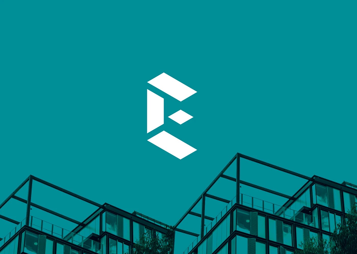
I presented three directions. One built an ascending stepped monogram around "accelerated lending" — progress as a literal staircase. Another built a checkmark into a bold magenta K-shape, dramatizing "powered finance" as deals getting closed. The third was a clean, multidimensional E, constructed on a precise geometric grid.
I recommended the third, for a specific reason: its multidimensionality could carry meaning the other two couldn't. Engine Capital doesn't lend one way — bridging, construction finance, first and second mortgages, sizes from $100K to $40M. The mark's facets read as exactly that: easy and simple, in multiple ways. It wasn't decoration standing next to the tagline. It was the tagline, built as a shape.
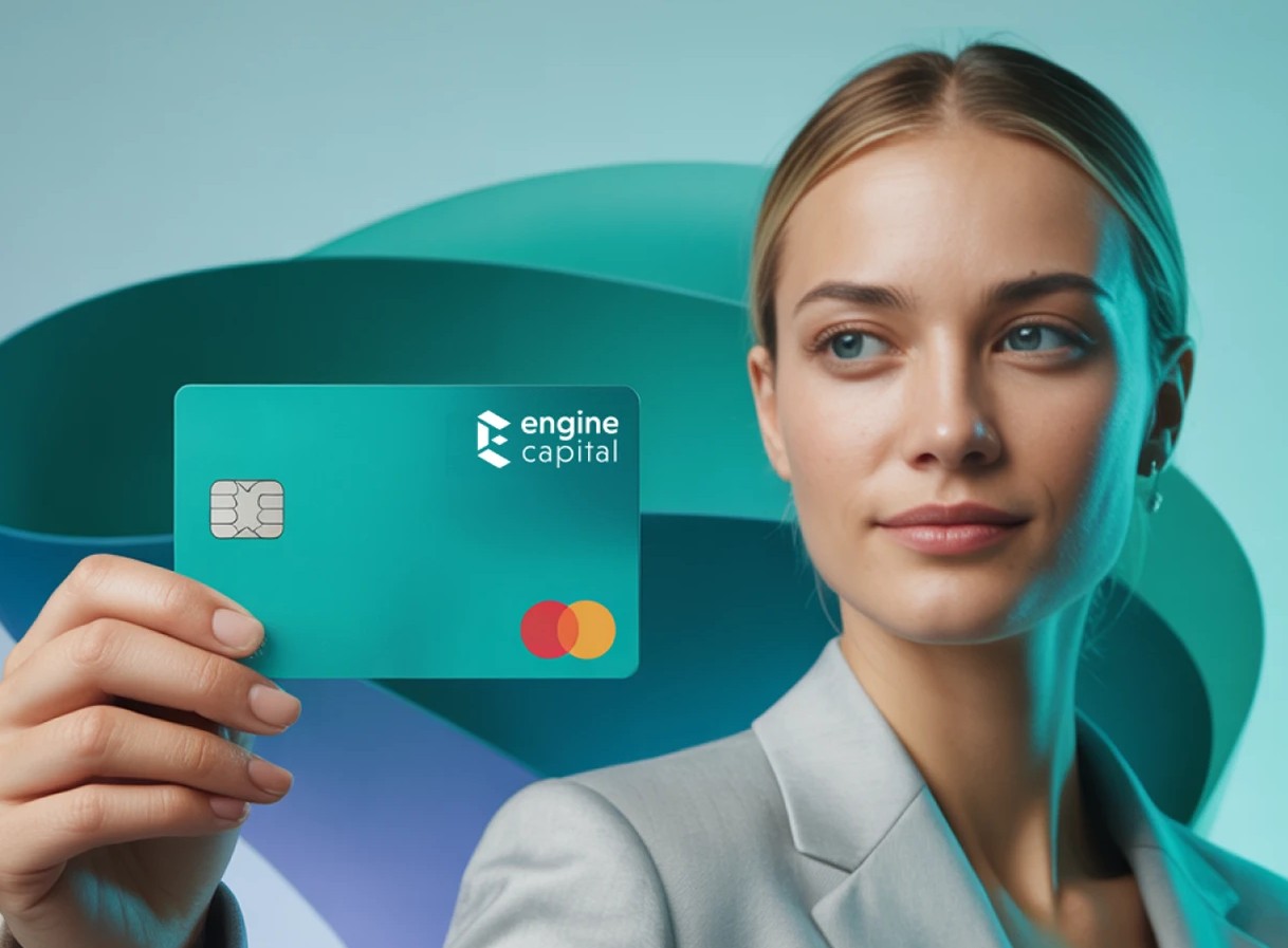
Pantone 320C — a clear, confident turquoise — was a deliberate departure from the navy-and-gold default the rest of the category was using. It wasn't chosen to stand out for its own sake. Lending carries built-in friction — paperwork, waiting, being told no. A category that only ever answers that with darkness and formality reinforces the friction instead of relieving it. Turquoise, handled with restraint and paired with a disciplined secondary purple for accents, reads as trustworthy without asking anyone to feel small.
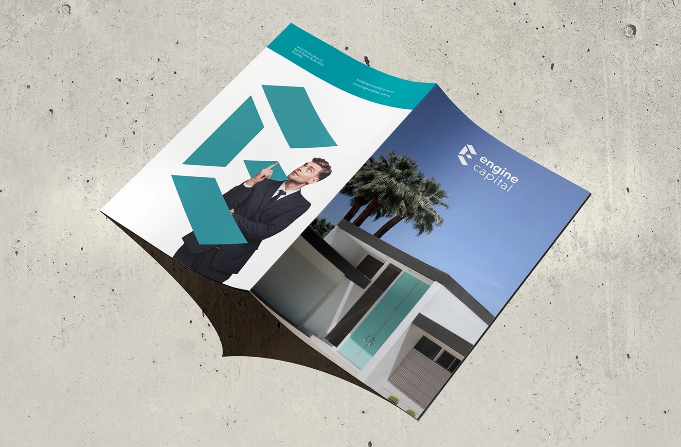
Niveau Grotesk carries the logotype; IBM Plex Sans runs the digital and headline layer; Merriweather handles long-form print — a defined hierarchy so every context has an obvious answer instead of a judgment call. Around it: minimum clear-space and sizing rules, monochrome and reversed lockups, a symbol-only version sized for social profiles, a tessellated pattern built from the mark's own geometry, and a poster-grid system that treats the identity as a container for whatever photography a piece needs.
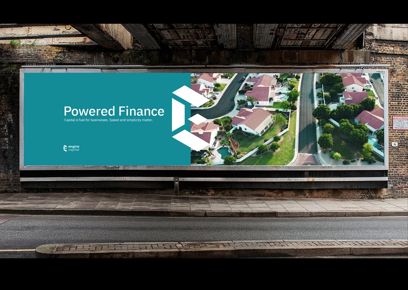
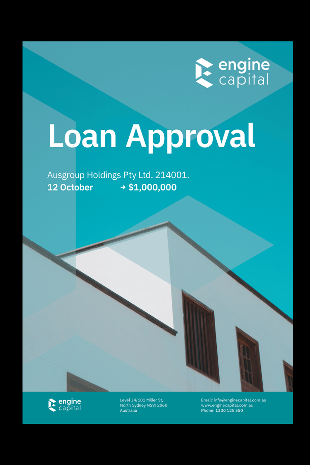
None of that is decorative. It's what lets a loan-approval document, a business card and a billboard all read as the same company — without a designer re-deriving the logic every time.
The founder's attachment to the previous mark's "engine/power" idea was real, and it surfaced early — a legitimate question about how much of what he'd already built should carry forward. Rather than argue him out of the attachment, we worked through what a fresh start actually requires. A rebrand that keeps one foot in the old identity isn't a rebrand — it's a compromise wearing a new colour. Once that was named plainly, the decision to go fully into the new direction wasn't a hard one.
The clearest signal came in the room, at the first presentation: the client didn't need convincing on the winning concept — the mark did in one image what two taglines had been trying to say in words. "Multiple ways" stopped being my language for the idea and became theirs.
I designed the identity system — the logo, the guidelines, the collateral. The website that carries it now is theirs, built later by their own team. That's not a footnote; it's the test a system is supposed to pass — if the colour, the mark and the type hold together on a page I never touched, the guidelines did their job.
Powered finance. Accelerated lending. The words were already true — the job was giving them a shape people would believe before they read either one.
I take on a small number of strategy & identity engagements for companies in fintech, medtech and civic tech.