DRI had a logo and dozens of country offices, but no system holding them together. For an organization whose entire value is credibility, that inconsistency wasn't cosmetic — it read as a lack of authority, in exactly the countries where authority was hardest to earn.
Democracy Reporting International is an independent, impartial nonprofit based in Berlin, working to strengthen democracy and human rights across dozens of countries. By the time I came on, the organization had real scale and real credibility in the field — but the visual identity hadn't caught up. There was a logo and some materials, but nothing that functioned as a system.
Every country office was, in effect, interpreting the brand on its own. For most organizations that's an inconvenience. For an NGO whose entire currency is trust, inconsistency reads as a lack of authority — exactly where authority is hardest to earn and easiest to lose.
The identity also had to do something most identities never have to: work the same way across genuinely different cultures and scripts, not just different countries speaking the same language with a translated tagline.
The organization needed to look like one authority, not a loose federation of offices each showing up their own way. But "consistent" isn't enough on its own — the mark had to be legible and trustworthy on first sight, before anyone read a word of the language it was sitting next to.
Most identities are designed for one primary context and then adapted outward. This one had to be built for universality from the start: simple and geometric enough to be absorbed by as many cultures as possible, without asking any of them to translate it first — closer to the timeless, reduced logic of marks that read the same everywhere, than to a typical campaign-driven identity.
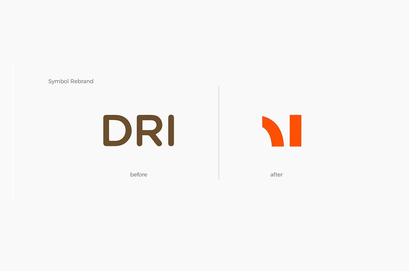
The strategic decision was to not invent an unrelated new symbol. DRI already had equity in its own shorthand — the letters themselves. The brief I set for the mark was to find the new identity inside the old one, rather than break with it. For an NGO that had built real trust under its existing name, continuity mattered as much as clarity.
The same logic shaped the typography. I chose Noto Sans and Noto Serif specifically — Google's free type library built to support virtually every script in the world. That wasn't a default choice; it was the direct answer to a 36-country constraint: the same typographic consistency had to hold regardless of which alphabet a country office was actually setting text in.
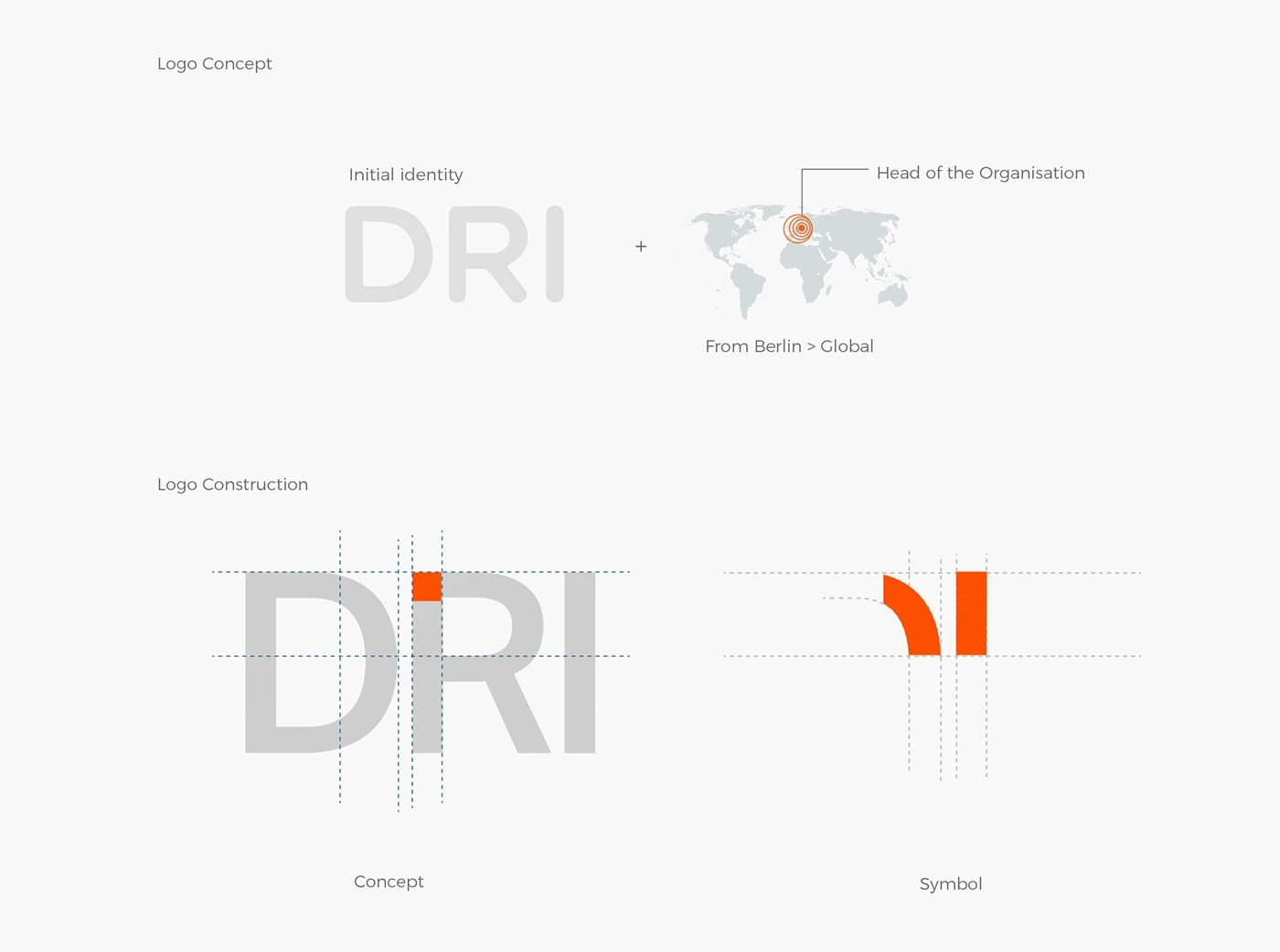
I explored several directions, but the one that held up was the simplest: I overlapped the letters "DRI" — the organization's own shorthand — directly onto a map of the world, and looked for where Berlin, the headquarters, intersected with the letterforms.
From that intersection, I cut the symbol's essence directly out of the letters, starting from Berlin. The resulting mark isn't a generic geometric abstraction — it's DRI's own name, sliced at the exact point where its headquarters meets the world it works in. The same shape reads as an extracted letterform and as a line spreading outward from a single point, which is precisely what the organization does: starts centrally, in Berlin, and pushes its values outward, globally.
The old identity's brown gave way to a clear, confident orange — a deliberate shift toward optimism and determination, paired with a small disciplined secondary palette so the system could flex across print, digital and editorial without losing its center. The contrast between the bold symbol and the quieter logotype was intentional: it gives the mark somewhere to generate interest on its own, separate from the name.
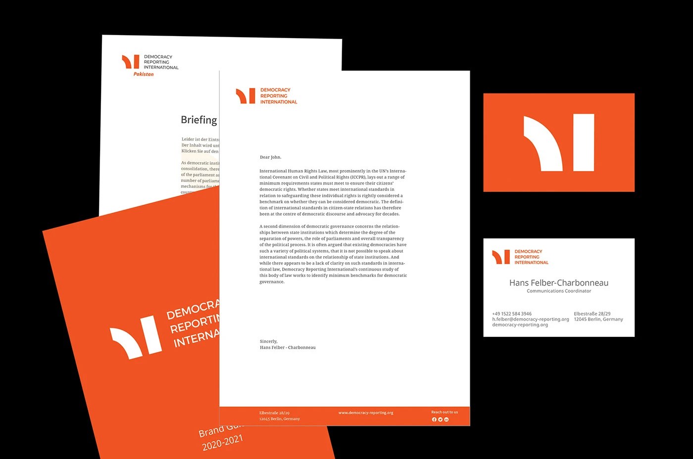
With offices across dozens of countries, the temptation is to let each one develop its own visual flavor. I went the opposite way: the only differentiator between the global mark and any country office's version is the name itself. No extra colours, no local iconography, no per-country creative decisions to maintain — because with this many offices, any added variable becomes a maintenance problem eventually.
The hierarchy is precise rather than arbitrary: the country lockups are sized so the symbol-plus-name occupies the same visual weight as the standalone global mark, with the country name sitting as a clearly secondary element beneath it. Every office reads instantly as this organization, locally — not a separate entity that happens to share a logo.
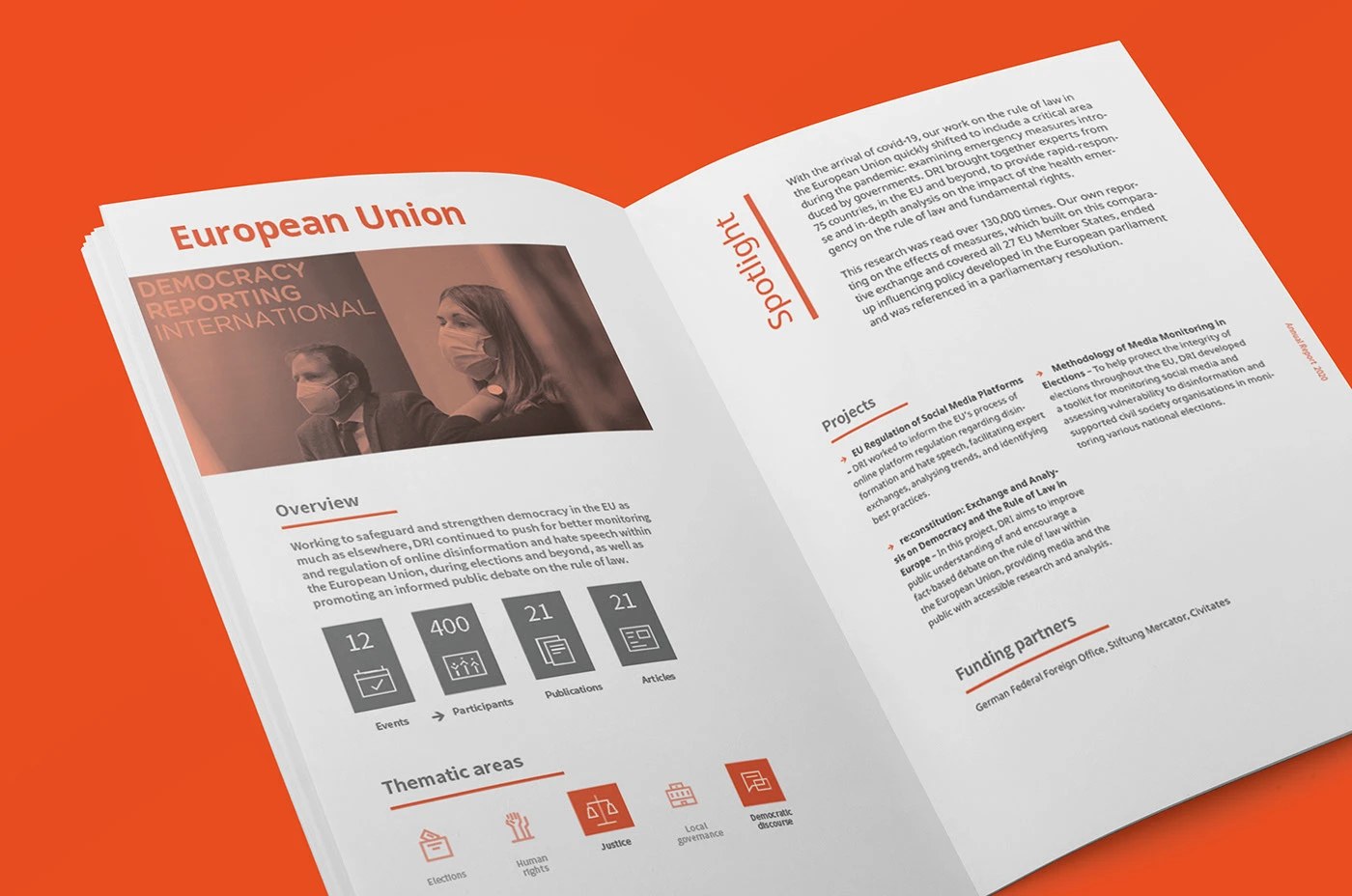
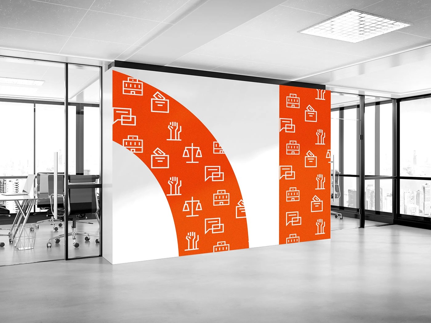
The icon set covering DRI's thematic areas — elections, justice, human rights, local governance, democratic discourse — follows one hard rule: consistent stroke weight, no rounded corners, straight lines only. That's a formal decision with a point behind it: an organization whose work is standing firm on principle gets a visual language that doesn't soften its corners either. The same geometric logic carried into the office environment itself, where the mark's arc became wall-scale environmental graphics — the identity extending into physical space, not just staying on letterhead.
After delivery, the organization visibly pulled together — country offices adopted the new colours, type and guidelines, and the pattern became recognizable across very different contexts. See the mark in one country, and you recognize it in the next — which is a small thing until you realize that recognizability is what "looking bigger" and "being trusted" actually run on.
I'll say the honest part too: I don't control what happens to a guideline over years, especially inside an NGO where many people, in many countries, are touching the brand day to day — that's a different discipline than a single corporation enforcing a style guide. Not every application stayed perfectly on-system. What did hold is the recognition — the organization reads as more coherent, more visible, and more clearly itself than it did before a system existed at all.
The most global identity isn't invented from nothing. It's the one simple enough that every country recognizes itself in it.
I take on a small number of strategy & identity engagements for companies in fintech, medtech and civic tech.