© Concept ProjectUTCB — Education

One symbol, split into seven™

UTCB trains the engineers behind everything we never notice — the buildings, roads, water and heat that only make the news when they fail. A 200-year tradition, carried by an identity too rigid to speak to the students it needed. The brief: keep the seriousness, open the door.

Concept for
UTCBTechnical University of Civil Engineering, Bucharest
Sector
EducationHigher education · Engineering
Type
Self-initiatedConcept identity system
Disciplines
Identity systemStrategy · Icon system · Naming & messaging · Environmental · Guidelines
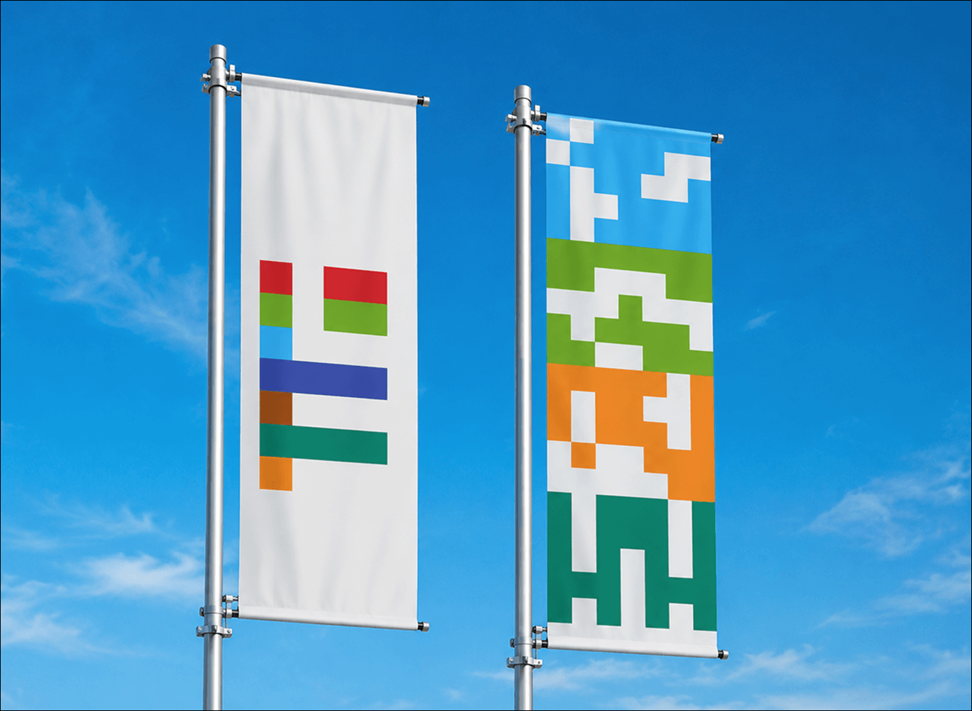
UTCB construction university visual identity — outdoor flags carrying the seven faculty colours
01 — Context

A proud institution with a perception problem.

UTCB's seven faculties train engineers for nearly everything that makes up the built environment — buildings, railways, roads and bridges, dams and water networks, building services and machinery. Serious, essential work.

But it competes for applicants with much larger institutions, in fields the media portrays as more attractive. Its studies are seen as difficult, and civil engineering makes the news mostly through its failures — the collapse, the burst pipe, the road that never opened. Everything that works, nobody notices. The work is invisible precisely because it works.

Everything that works, someone built it.
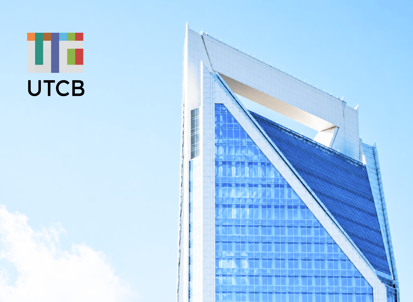
UTCB construction university building with the new visual identity applied
A proud institution
Two centuries of tradition — carried by an identity that had stopped speaking to the students it needed.
02 — The Challenge

Keep the seriousness. Open the door.

The old identity didn't help. It was built around a single symbol — rigid, academic, hard to shape into anything that spoke to young people. For a technical field already seen as difficult and unglamorous, a closed identity only confirmed the impression.

The brief asked for a new identity that would keep the seriousness and tradition of a technical field, while feeling more approachable — a place where creativity has room, addressed to students and the parents who advise them. Two things that don't automatically agree: gravity and openness.

03 — The Idea

The answer came from the vocabulary of construction.

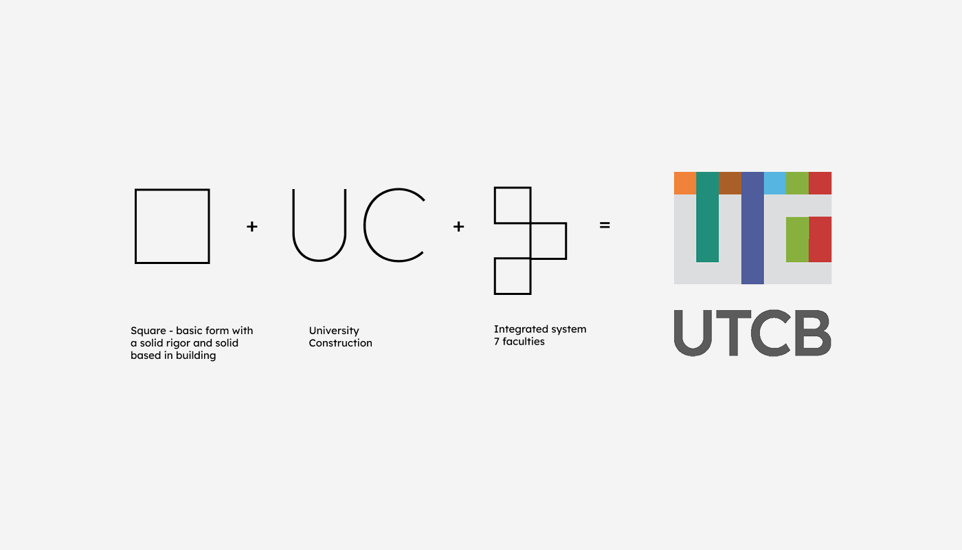
The identity starts from two ideas in the brief: the built environment, and “we build education.” The answer, fittingly, came from the language of building itself — the square as the basic form, and the grid.

The square and the grid carry seriousness, respect for tradition, and the solid foundations of the built environment. Abstracting them into constructed forms brings in the range of disciplines the university teaches — and, with it, creativity and a modern edge. Gravity and openness, from the same source.

On top of the visual system sits a message platform that makes the invisible visible, on three levels: the university builds education; the profession is behind everything that works; and the student gets to choose what they build.

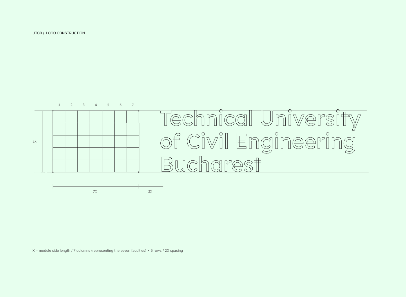
UTCB logo construction — the mark built from the square and a modular grid
Built from the square
The construction logic of the mark — square, grid, constructed form.
UTCB main symbol — the primary monogram mark
The mark
Serious enough for tradition, open enough for a new generation.
04 — The Work

How the visual identity system was built.

4.1

One symbol, broken into seven.

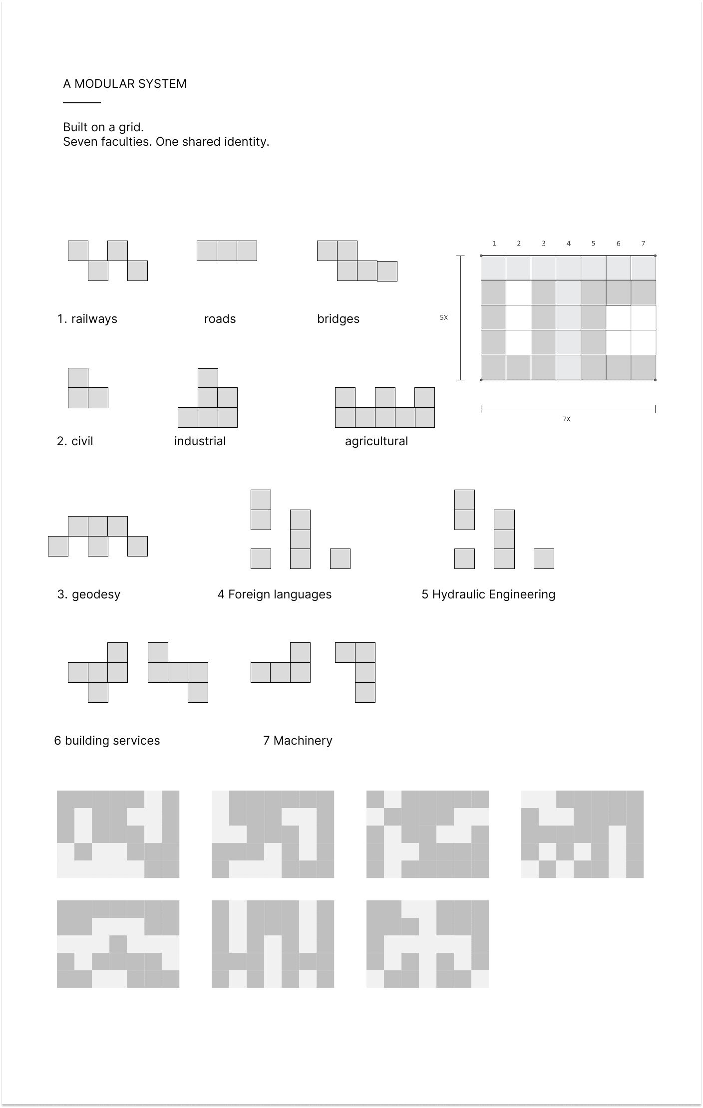
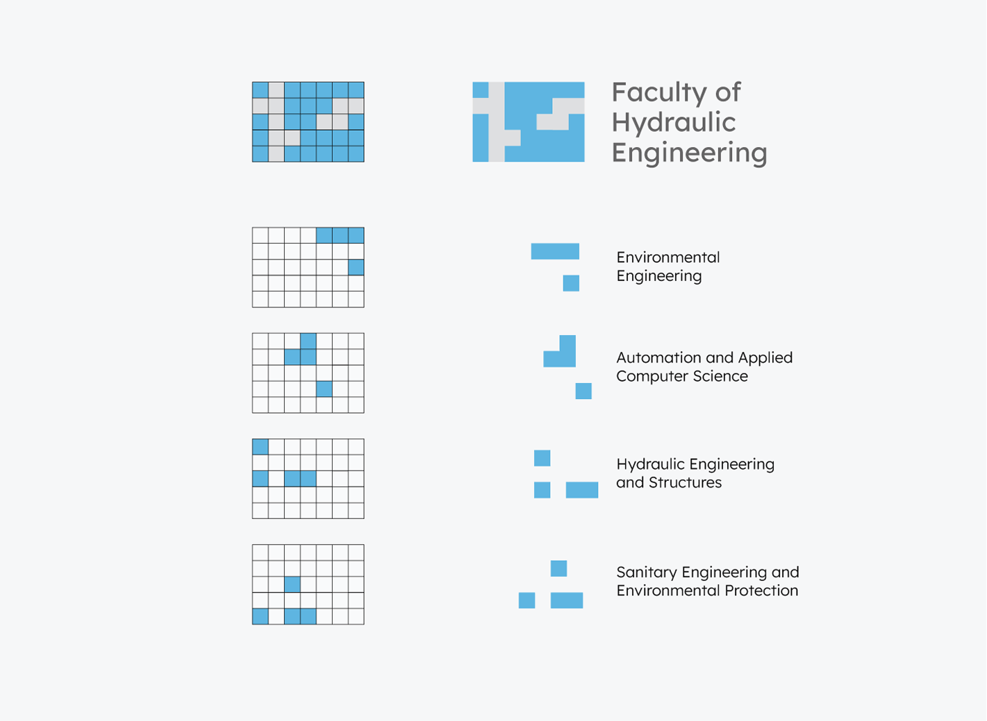
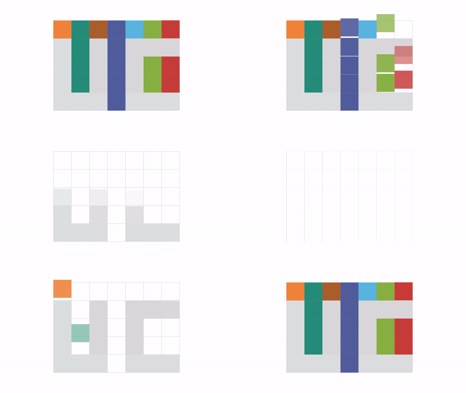
The single symbol breaks apart into seven elements — one per faculty. Each faculty gets an abstract pictogram built from keywords in its field: pipes for building services, the surveyor's tripod for geodesy. All of them are constructed from the same square, on a seven-column grid. Each faculty takes its own column and its own colour — and together, the seven columns form the UTCB monogram. The university becomes, quite literally, the sum of its faculties.

UTCB departments derivation — the single symbol splitting into seven faculty pictograms on a seven-column grid
The derivation
One symbol → seven faculties, each from the same square on a seven-column grid.
UTCB seven faculty pictograms — abstract icons built from field keywords, pipes for building services, a tripod for geodesy
Seven faculties, one logic
Built environment, railways & roads, building services, hydrotechnics, geodesy, machinery, engineering in foreign languages.
4.2

A structured system with room to grow.

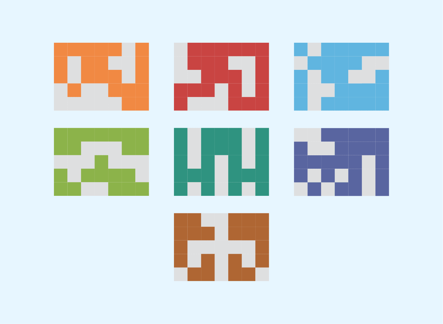
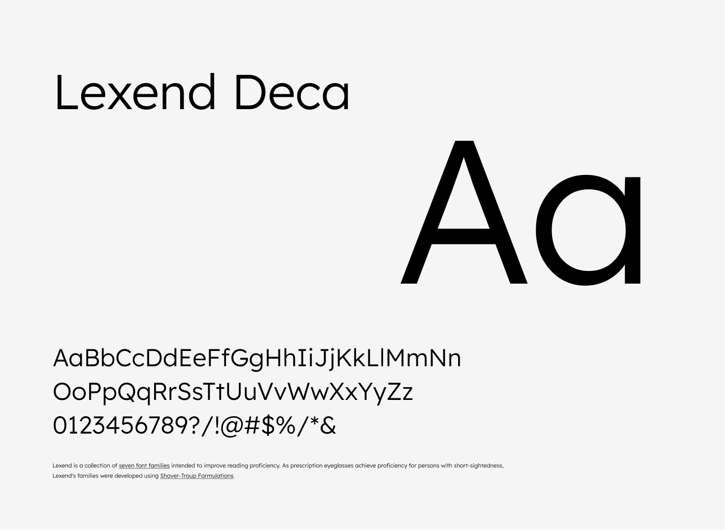
Seven colours — orange, blue-violet, green, red, teal, brown and light blue — identify the faculties and come together in the university's logo. The name is set in Lexend Deca across three lines. The faculty symbols join into a continuous pattern that generates new textures and compositions, so the identity stays recognisable while never running out of material.

UTCB modular identity system — faculty symbols combining into patterns and compositions
A modular system
Symbols that combine into an open-ended pattern language.
UTCB seven-faculty colour system — one colour per faculty, together forming the monogram
Seven colours, one whole
Each faculty its own colour; together, the UTCB mark.
UTCB typography — the wordmark set in Lexend Deca across three lines
Typography
Lexend Deca — legible, contemporary, quietly technical.
4.3

A message platform, not just a logo.

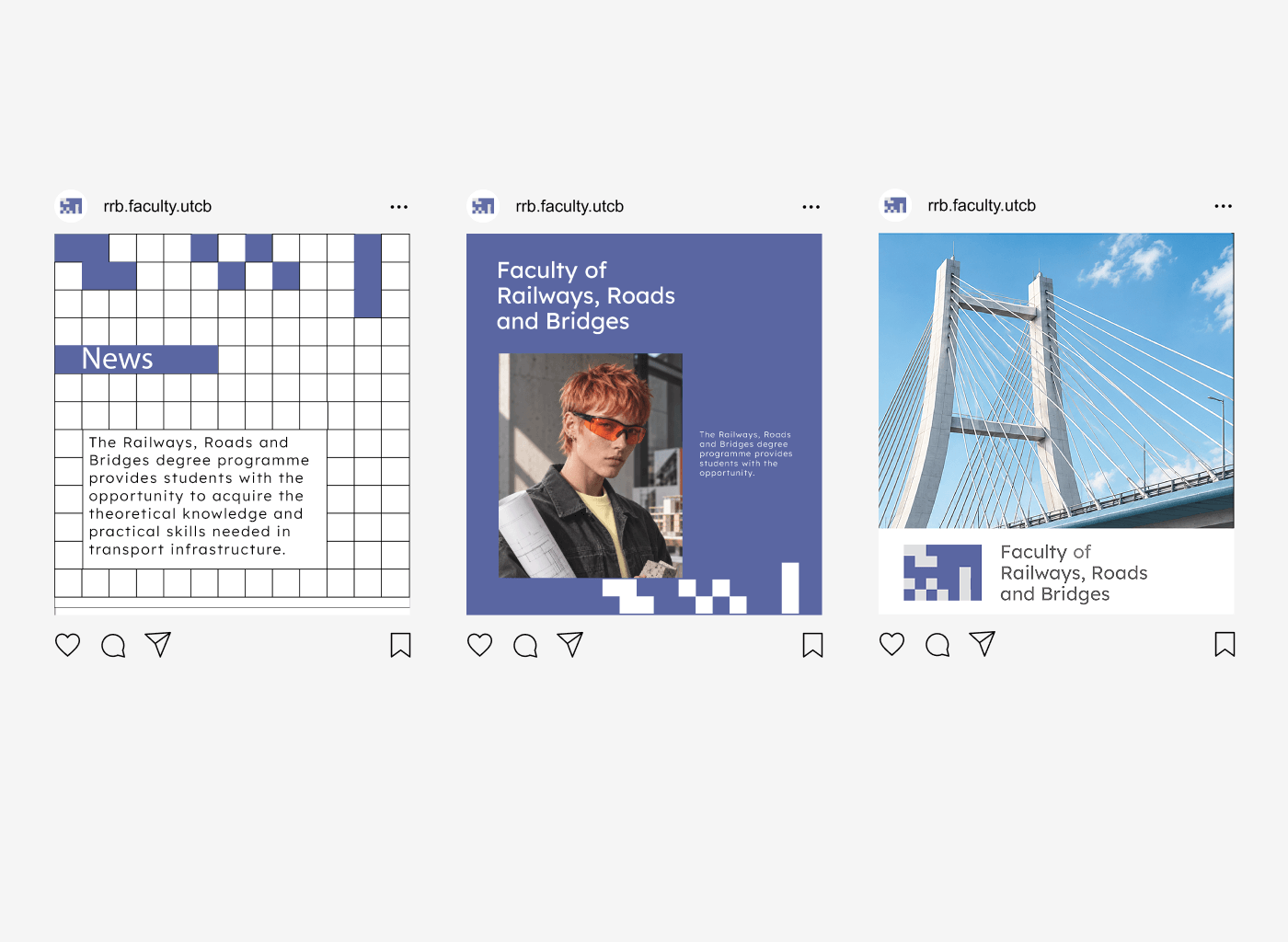
The identity carries a voice built to change the perception the brief described. Three levels of message, each answering a point in the brief: “We build education” for the university, “Everything that works, someone built it” for the profession, and “Choose what you build” for the student. Beneath them, a line for every faculty — “Connect cities. Connect people.” for roads and bridges; “Before anything is built, someone measures the world.” for geodesy.

UTCB social media system — posts pairing the faculty colours with the message platform
The voice, applied
Open days, admissions, faculty lines — one message platform across every format.
4.4

Built for the real environment.

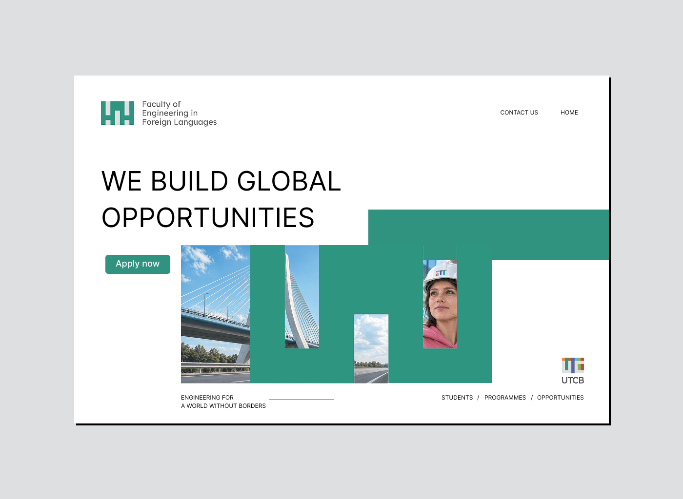
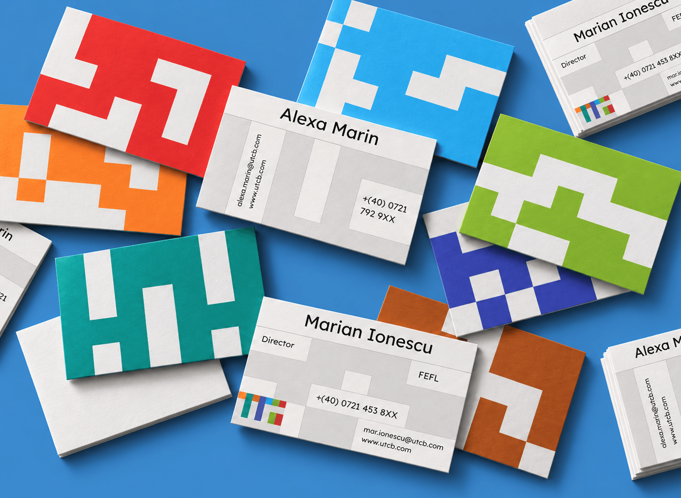
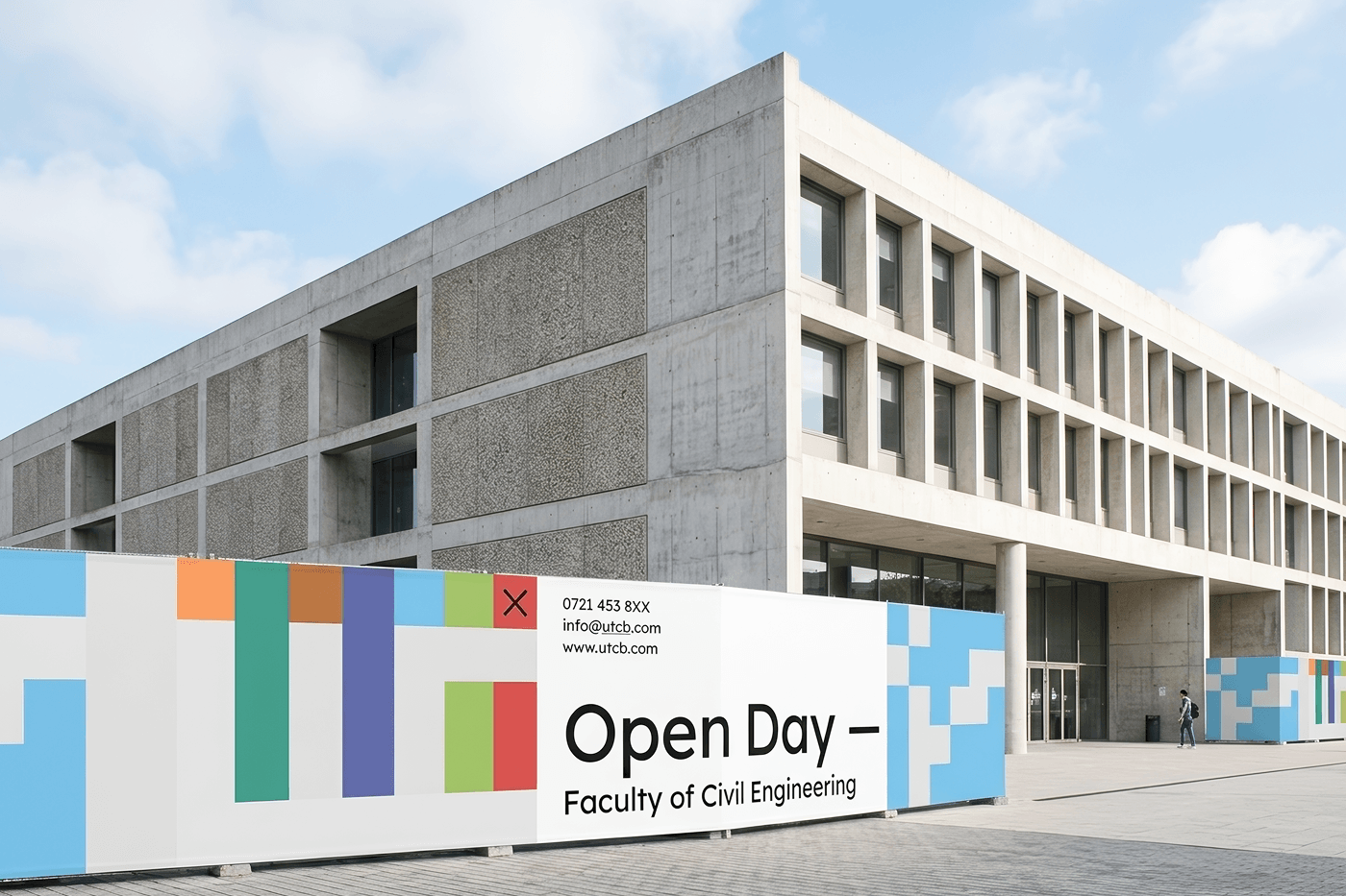
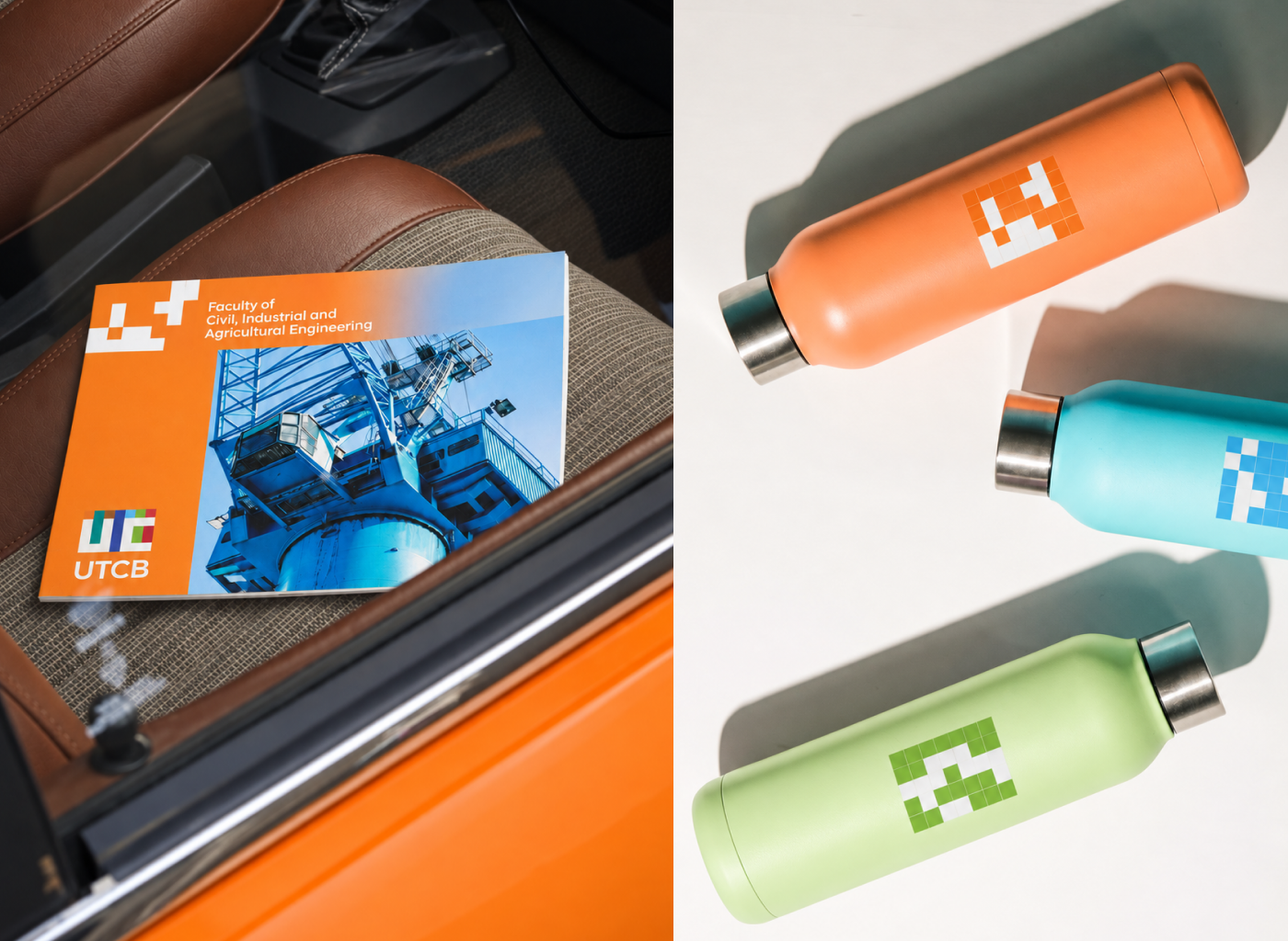
A system for a construction university has to live at construction scale. It extends from business cards, letterheads and brochure covers to the website, textiles, and large-scale applications across the built environment — flags, façades and open-day signage. The identity was designed for space, not just screens.

UTCB website design — the identity system applied to the university's digital presence
On screen
The website carrying the faculty colours and pattern system.
UTCB business cards and stationery — the modular identity in print
In the hand
Business cards, letterheads and print collateral.
UTCB open days environmental graphics — the identity at outdoor, architectural scale
At scale
Open-day and outdoor applications — the identity built for space.
UTCB campus merchandise — the identity on university apparel
On campus
Textiles and merchandise for students and staff.
The identity in motion
The system moving — symbols assembling, colours resolving into the UTCB mark. (Sound on to hear it.)
UTCB logo animation — the seven columns assembling into the monogram
Seven into one
The columns assembling into the UTCB monogram.
05 — The Result

Structure and solidity — with room to grow.

A modular identity system built from the square and a seven-column grid
Seven faculty identities derived from one symbol — each a colour, together the monogram
A message platform on three levels, plus a line for every faculty
A pattern language and applications from business card to architectural scale

The result is an identity built on structure and solidity that is also dynamic and attractive — serious enough for a 200-year tradition, open enough to invite the next generation in. And, like the university itself, made of parts that keep adding up: a system with room to grow.

Everything that works, someone built it.

— The idea the whole identity was built to make visible
More Work

Two more systems, cut from their own logic.

Have an institution that reads as closed?
Let's build the system™

I take on a small number of strategy & identity engagements for organizations where credibility is the whole point.