© Case StudyAccess Democracy — Civic Tech

When the work is done in code, the brand should speak it too

access://democracy monitors political discourse online and tests whether platforms tell the truth during EU elections — verification work done through technology and code. Its name already borrows the syntax of a trusted web connection, https://. The identity extends that logic: built from coding syntax and boolean expression, so the brand speaks the same language as the method behind it — the idea that technology, used with rigour, is how you protect honesty and transparency in a digital democracy.

Client
access://democracyEU election-monitoring initiative
Sector
Civic TechPlatform accountability · Digital Services Act
Year
2024Full identity system delivered
Disciplines
Brand identity & systemNaming logic · Identity · Guidelines · Templates
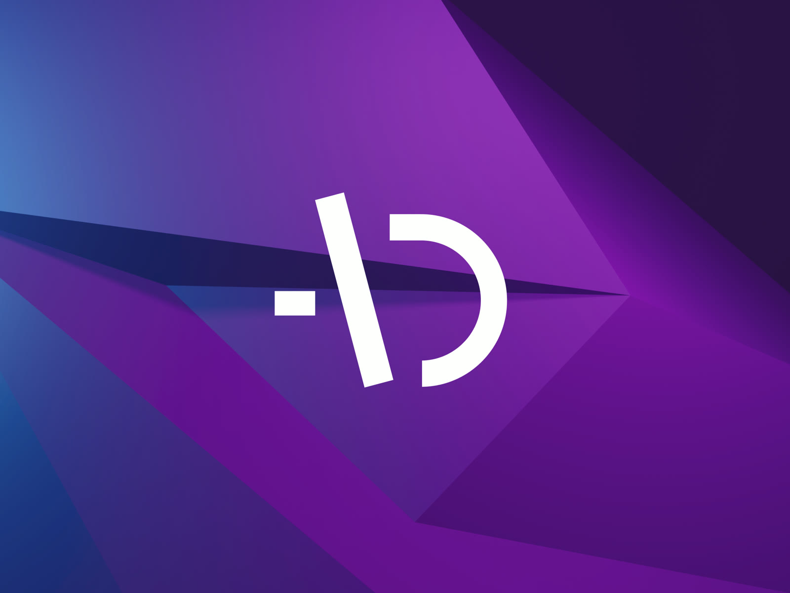
Access Democracy brand symbol — open D with a coding cursor line, white on a faceted purple and blue background
01 — Context

A new EU rule, and no proven way yet to check platforms kept it.

The EU had just finalised the Digital Services Act — a new framework for how platforms should handle illegal and harmful content — but nobody yet knew how auditing and accountability would actually work during a live election cycle. The actors spreading disinformation move fast and differ by country. Proving whether platforms were keeping their new obligations required the same speed: continuous, cross-country, evidence-based monitoring, not an annual report.

access://democracy was built to do exactly that, around two pillars: monitoring online discourse during key national elections, and generating evidence on whether platforms were adhering to the DSA. It had to reach electorates and civil society on one side, and EU regulators and the platforms themselves on the other — credible to both at once, which is a harder brief than it sounds.

And the whole thing runs on technology. The monitoring, the data, the evidence — it's all done in code, which is precisely what the identity had to find a way to show.

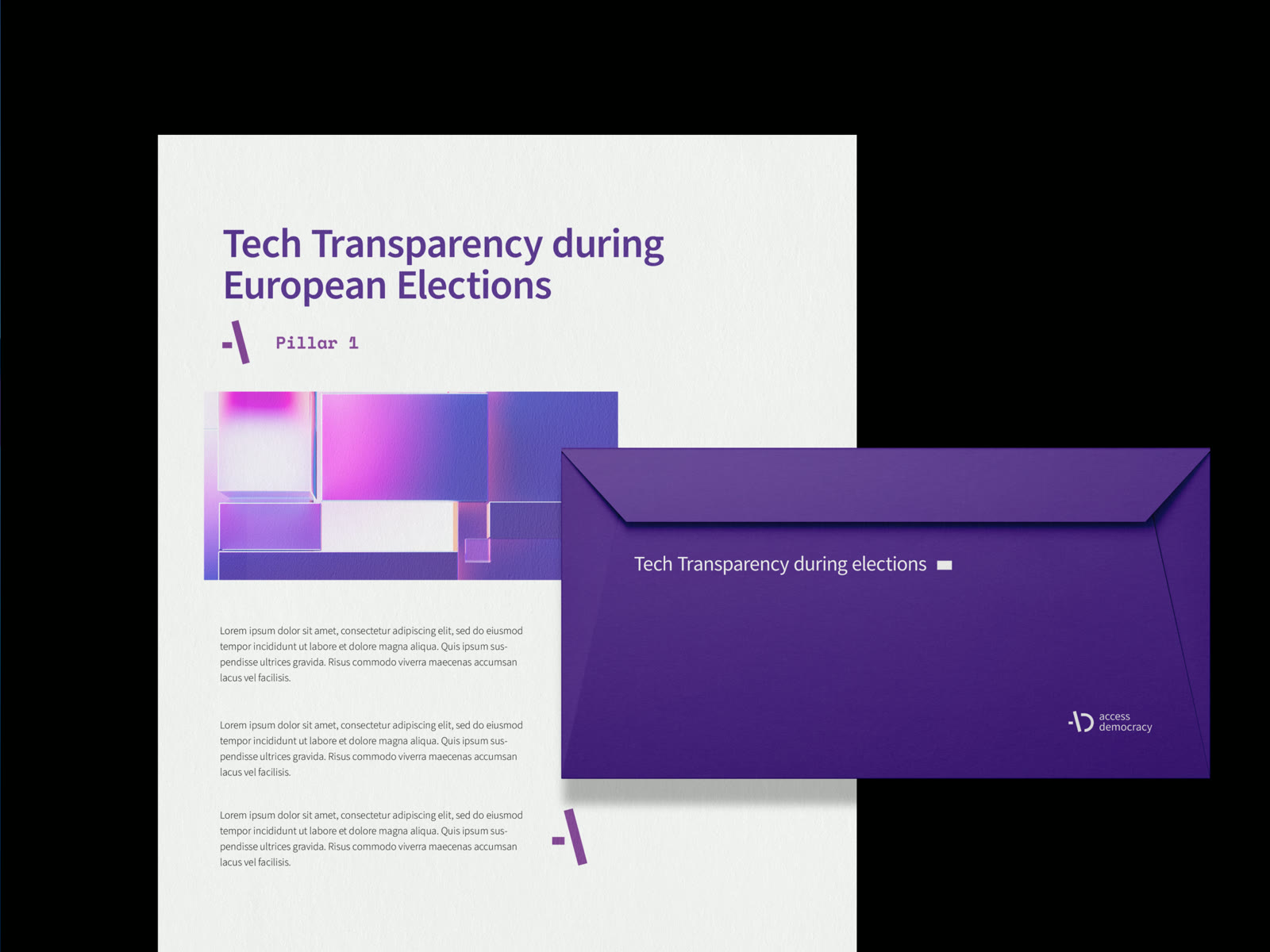
Access Democracy print collateral — purple envelope reading Tech Transparency during elections, alongside the logo mark on its own field
The system, applied
Print collateral and the mark on its own field — one identity carrying a technical, code-driven mission.
02 — The Challenge

Two jobs, two audiences — and a method most people can't see.

The initiative has two separate jobs — watching discourse, and auditing platforms against a regulation. Two workstreams producing two different kinds of output, for two different EU-level audiences, both still needing to look like one initiative, not two.

Underneath that sat the harder problem. The actual work is technical and invisible — monitoring, data, code — the kind of thing that's abstract to almost everyone it needs to convince. The identity had to make something rigorous and technical feel trustworthy and legible, without turning cold, or leaning on tech clichés that would undercut the seriousness of the work.

03 — The Strategy

Speak the language the work is already written in.

"access://democracy"

The name was already a small piece of branding on its own — a deliberate echo of https://, the protocol that tells a browser a connection can be trusted. Data access and transparency, dressed as the syntax of a secure web address. Rather than invent a separate visual metaphor, the strategy was to build the identity out of the language of code itself — coding syntax and boolean logic — so the brand speaks the same language as the technology doing the work.

That's the whole argument, compressed: this project reaches honesty and transparency through technology, so the visual system should be built from technology's own grammar. The mark then argues exactly what the method proves, instead of decorating it from the outside.

It's a move I keep coming back to — a system drawn from something the client already owns rather than a shape imported from elsewhere. Here, that source was the coding syntax sitting inside the name itself.

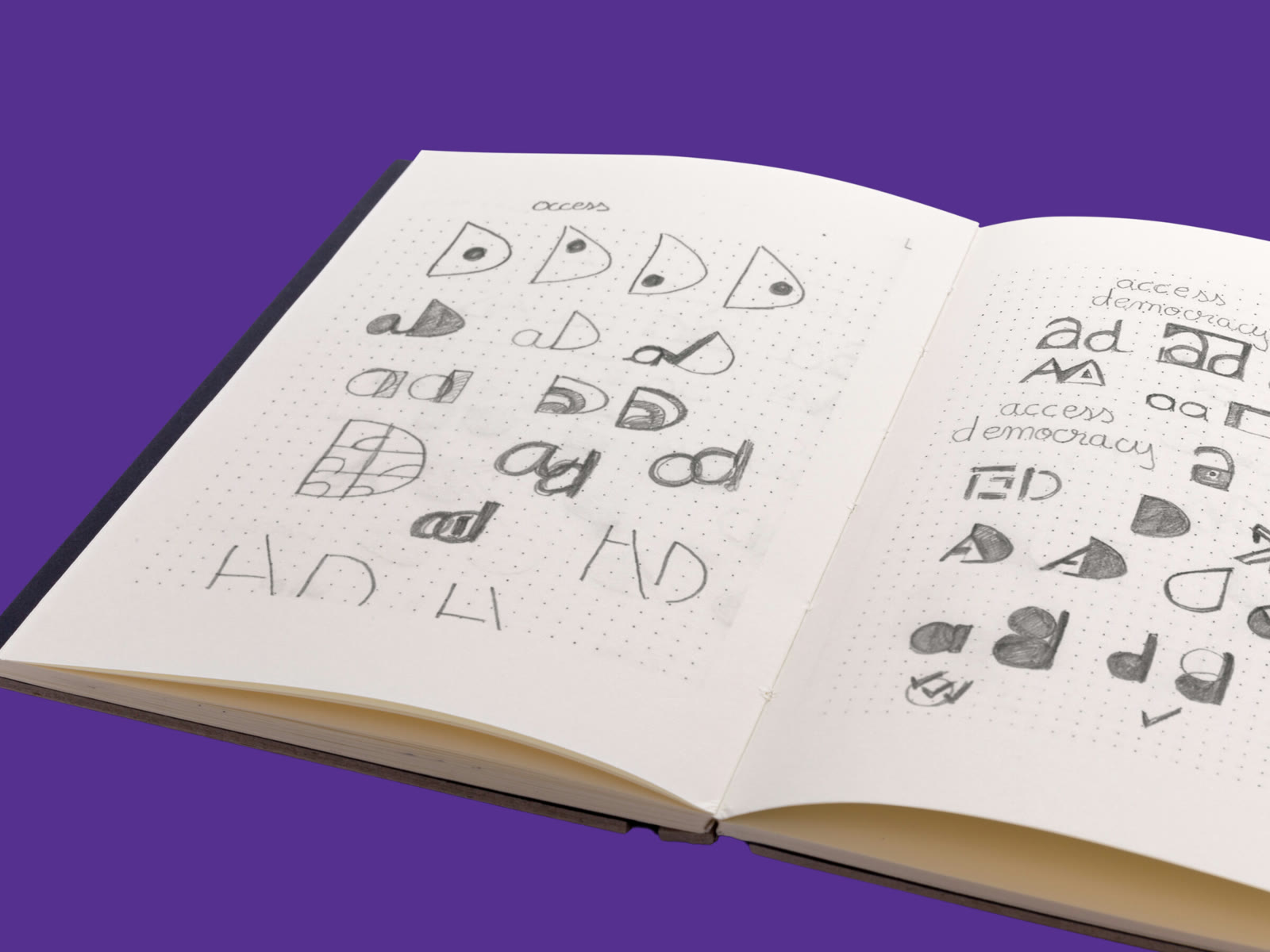
Access Democracy sketchbook — pencil explorations of the open D and A letterforms, on a purple background
Where the mark started
Pencil first, pixels later — pages of open Ds and As, looking for the version that could hold the coding reference without losing the letters.
04 — The Work

Built from its own logic.

01

A symbol taken from the coding syntax already inside the name.

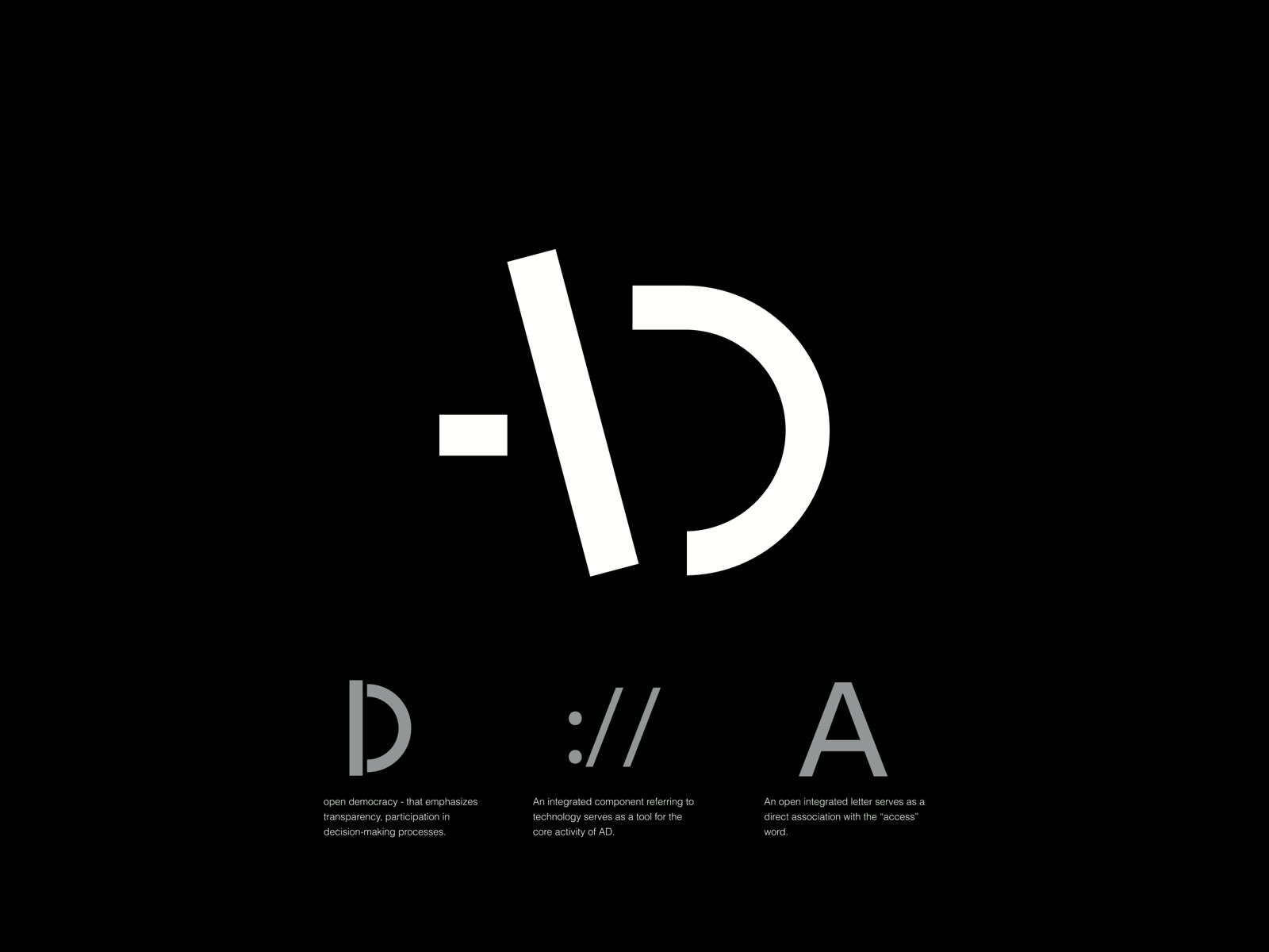
The symbol pairs an open "D" — democracy, deliberately left unclosed, a small argument for openness — with an open "A" for access. Between them sits a single line that reads two ways at once: a text cursor blinking in a code editor, and the "//" of a web protocol. The mark started closer to a literal double slash and simplified, over several rounds, down to this cleaner single gesture. The coding reference isn't decoration next to the name — it's built directly into the letterforms.

Access Democracy symbol anatomy — the open D for democracy, the :// protocol reference, and the open A for access, explained on black
The anatomy
Three readings in one mark: an open D for democracy, the "://" of a web protocol, an open A for access.
Access Democracy logo animation — the middle dash blinking on and off like a text cursor in a code editor
The cursor, blinking
In motion, the dash does what a cursor does — blinks, and waits for what gets written next.
02

Boolean logic, turned into a visual language.

Around the mark sits a small family of complementary graphics pulled from coding and boolean logic — including the double-bar symbol for logical OR, used to flag the exact moment a piece of content's truth is in question: true, or false? It gives the brand a way to visually interrogate — the same act the monitoring work performs on the discourse it watches. Each graphic carries one specific meaning and appears only as an accent, never as decoration.

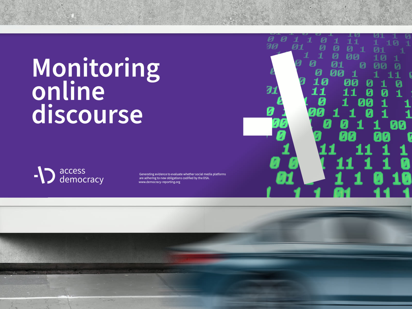
Access Democracy outdoor billboard reading Monitoring online discourse — the Pillar I symbol fragment over green binary code on purple
The language, at street scale
"Monitoring online discourse." A pillar fragment of the mark over raw binary — the method itself, blown up to billboard size.
03

A purple that reads digital — and a system the team can run alone.

The primary colour — Pantone P96-8C — is a purple chosen because it reflects the mission itself: technology, the digital realm, an independent and authoritative voice. Two secondary colours, green and a deeper magenta, quietly code the two pillars — monitoring, and evidence — without outranking the primary. Type stays to one family, Source Sans Pro, with a single monospaced accent, Space Mono, reserved for highlighting words with a coding reference. All of it runs on a nine-column grid pulled from the "A" of the symbol, and on ready-made templates — election briefs, policy papers, a conference deck — so a programme officer, not a designer, can publish the next piece on an election-cycle schedule.

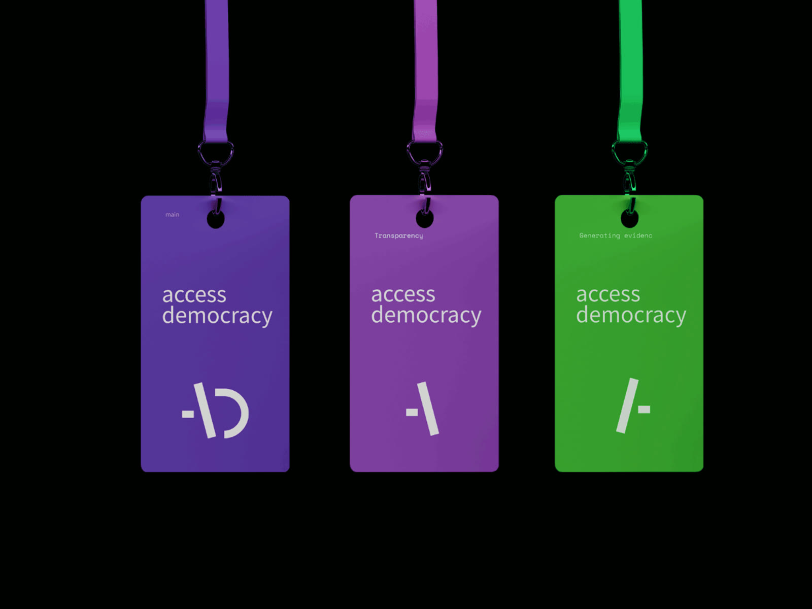
Access Democracy lanyard badges in the three brand colours — main purple, magenta for transparency, green for generating evidence — each with its own symbol fragment
One system, three voices
Main purple, and the two pillar colours — each badge carrying its own fragment of the mark.
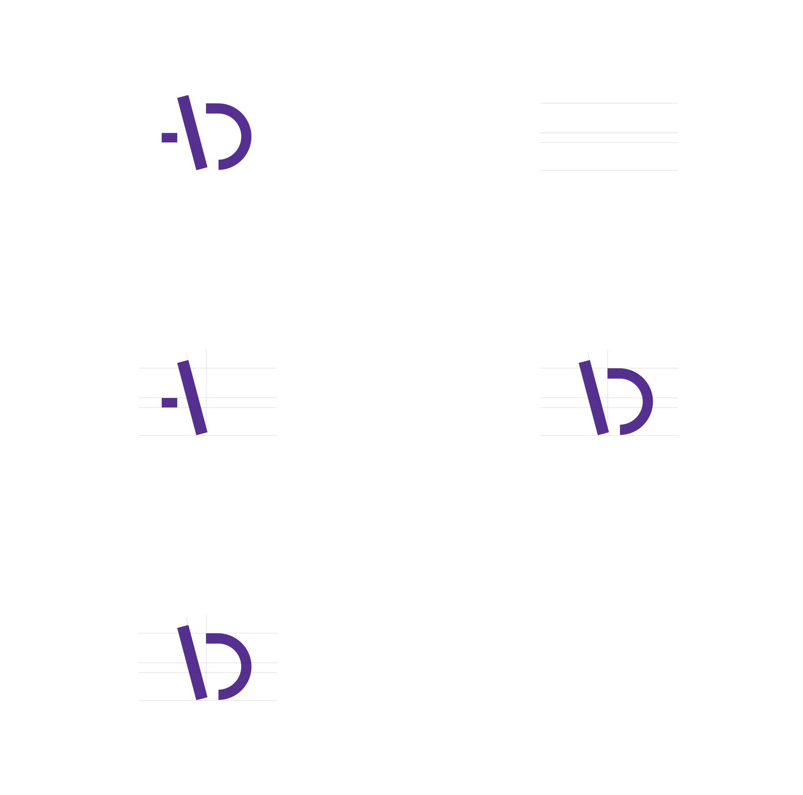
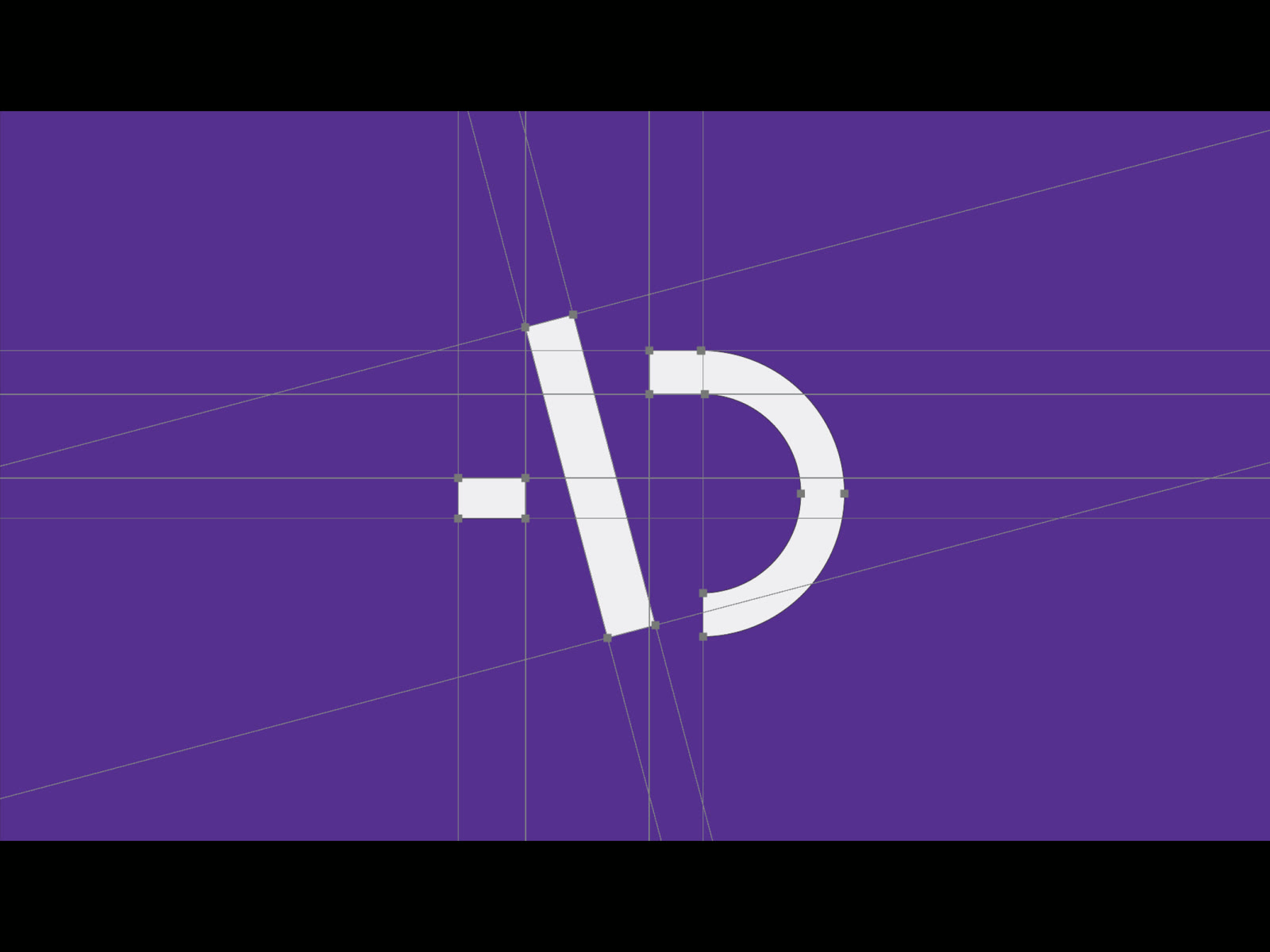
Access Democracy logo construction — the symbol drawn on its geometric grid over the brand purple
Nothing freehand
The symbol on its construction grid — the same discipline that runs the nine-column layout system.
05 — The Results

An identity that had to work as a policy document and a billboard, the same week.

A logo and standalone symbol built for web, social and print, with monochrome and reversed lockups, minimum-size rules, and crops for square and circular social profiles
A visual language of coding-inspired and boolean-logic accent graphics, plus two secondary colours coding the initiative's two workstreams without competing with the primary purple
Ready-to-use templates: PDF layouts for election briefs and policy recommendation papers, a PowerPoint for conferences, and business stationery
A single-typeface system on a grid drawn from the mark itself, kept deliberately simple around the ideas of access and openness

The identity had to do the hardest thing a technical project asks of a brand: make a rigorous, code-driven method feel trustworthy and legible in under a second — to a regulator skimming a briefing, not a designer studying a guideline.

And because the system was built around one simple typeface and ready-made templates rather than a designer's ongoing involvement, the team could keep publishing election briefs and policy papers on its own, on whatever schedule an election cycle demanded — the actual point of handing over a system instead of a one-off logo.

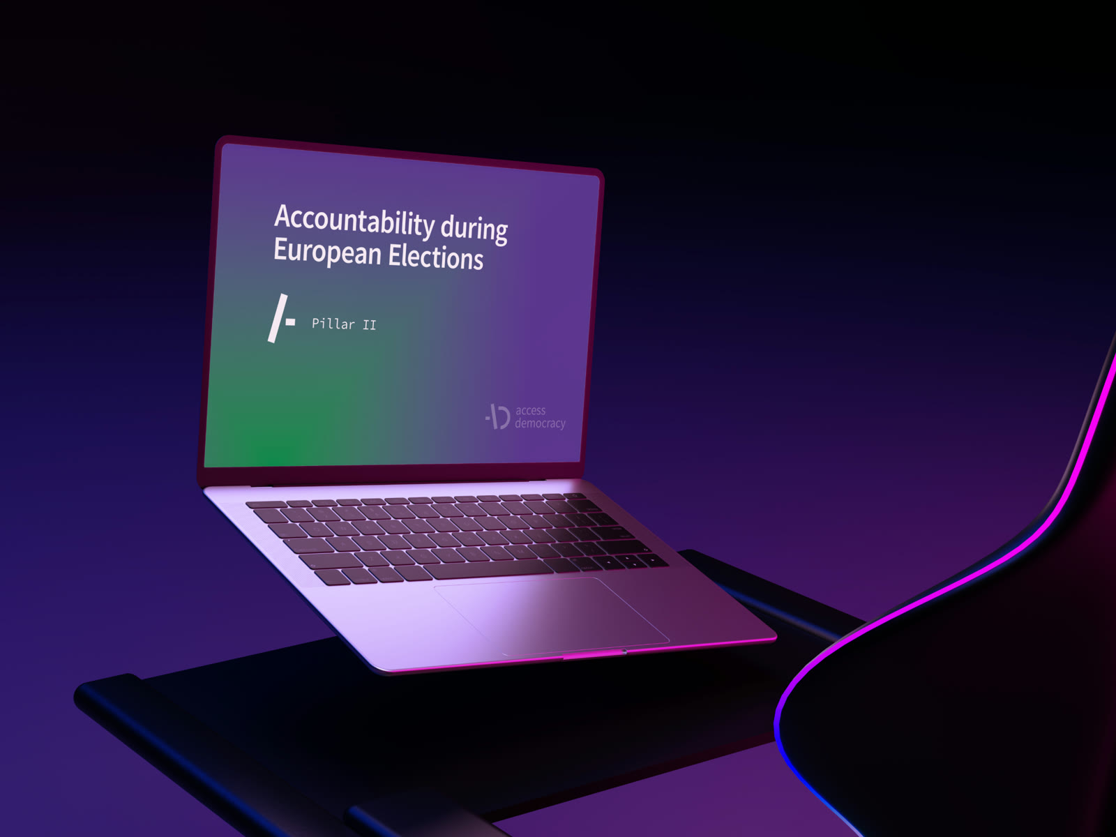
Access Democracy presentation on a laptop screen — Accountability during European Elections, Pillar II, purple to green gradient
In the room where it works
"Accountability during European Elections" — a Pillar II deck, running on the template the team uses without me.

Access, transparency, democracy — the name was already making the argument. The job was building a mark that made the same argument without saying a word.

— The brief this project kept coming back to
More Work

Two more decisions, two more systems.

Have a mission that has to look as rigorous as it is?
Let's build the system

I take on a small number of strategy & identity engagements for companies in fintech, medtech and civic tech.