© Case StudyNorthMed — Medtech

Building a system around a logo I didn't design

NorthMed came with exactly one brand asset — a logo they were committed to keeping — and a problem no logo can solve: looking as credible as they actually were, everywhere they showed up.

Client
NorthMedDigital health & medical innovation
Sector
MedtechInnovation hub · Education · Events
Year
2024Full system delivered
Disciplines
Brand strategy supportIdentity system · Icons · Environmental · Guidelines · Event collateral
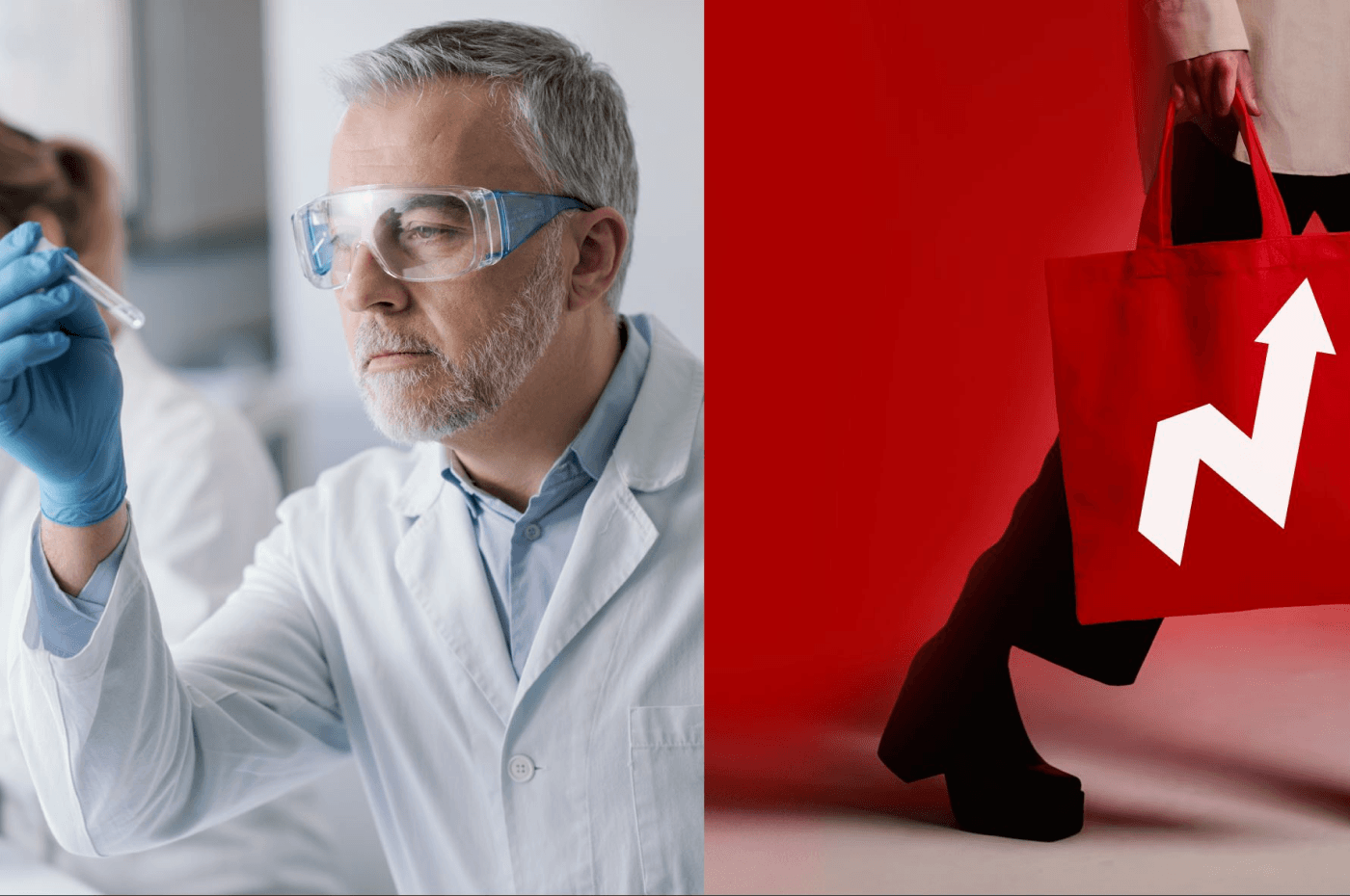
NorthMed medtech brand identity — researcher in the lab and branded tote bag, the system living in the real world
01 — Context

An organization with substance — and a single logo to show for it.

NorthMed is a digital health and medical innovation organization in the Galilee, built to bring professionals from the Arab community into medtech — through an innovation center, education programs, workshops and industry events. By 2024, the substance was there: the center was opening, the calendar was filling with events, and the organization was operating across very different rooms — clinical innovation, education, conferences, digital.

The brand wasn't keeping up. Every activity looked like a different organization. And in healthcare, where trust is the entire value proposition, that gap between who they were and how they appeared was costing them credibility they had already earned.

They found me through a previous project — the complete rebrand of Democracy Reporting International, a global organization active in 36+ countries, where one identity had to work across editorial, iconography, digital and print. Their first message was, in essence:

"This is what we want. Not a logo — a system."
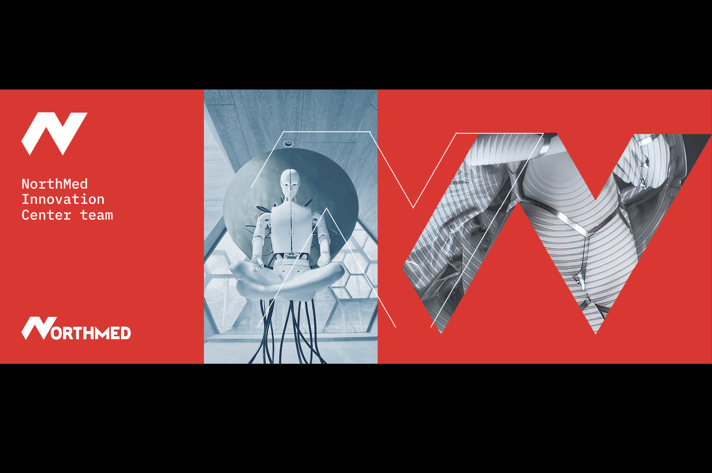
NorthMed Innovation Center team banner — medtech imagery set inside the letterforms of the brand mark
The world the brand had to live in
An innovation center, education programs, workshops and industry events — one mark carrying all of it.
02 — The Challenge

They didn't need a rebrand. They needed everything except the rebrand.

The brief came with one non-negotiable: the existing logo stays. Around it — nothing. No typography system, no color logic, no icon language, no guidelines. No way to show up consistently across activities as different as clinical innovation programs and community meetups.

Most identity work starts from a blank page. This started from the opposite: a fixed point I didn't choose, and a coherence problem I had to solve around it.

03 — The Strategy

Two inputs that don't automatically agree.

A coherent system needs a fixed point and a direction. The fixed point was given — the inherited logo, its geometry, its red and white. The direction had to come from positioning: who NorthMed needed to be credible to, and what that audience needed to feel.

So every decision in the project answered one question: where do these two inputs find coherence?

The positioning answer was clear. NorthMed needed to communicate professionalism, integration, and a whole-system approach — to feel like the serious, established organization it already was. In health and medtech, audiences rarely articulate why something feels trustworthy. They just feel it, or they don't. The identity had to produce that feeling on contact.

04 — The Work

Four decisions, and the reasoning behind each.

4.1

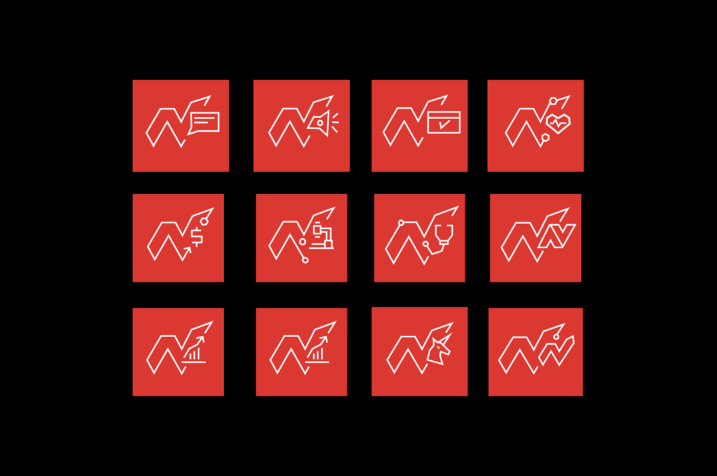
The icon system grew out of the logo's skeleton.

Instead of treating the untouchable logo as a dead constraint, I used it as the generative source of the system. The structural skeleton of the existing symbol became the constructive logic for a full icon set — same underlying geometry, same visual DNA. The icons don't merely match the logo; they are demonstrably of it. The inherited element stopped being a limitation and became the system's origin point.

NorthMed custom icon system — twelve icons on red tiles, each constructed from the geometric skeleton of the existing logo
The icon system
Twelve custom icons, one constructive logic — the geometric skeleton of the inherited mark, extended into a full language.
4.2

A disciplined palette, with room for every sub-activity.

NorthMed's world was the red and white of their logo. I harmonized this into a deliberately simple, neutral primary palette — restraint reads as confidence in healthcare — then built complementary derivative colors for their sub-activities: programs, workshops, meetups. Each derivative fits the whole while remaining distinguishable, so the organization reads as one entity with many facets, not many entities sharing a logo.

4.3

An identity designed for space, not just screens.

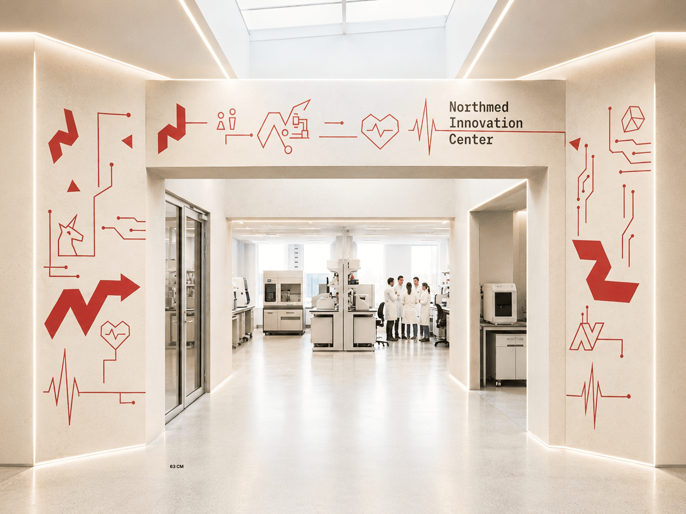
The system had to live physically: environmental graphics across the offices, including the company's pipeline — how their work actually flows — visualized as wall graphics. The most telling constraint: exposed pipes running from the ceiling, integrated into the icon and graphic language rather than hidden. Architecture became brand surface. The information design had to do real work here — communicating what the company does, spatially, not just decorating walls.

NorthMed Innovation Center environmental graphics — the brand's icon language painted at architectural scale around the lab entrance, researchers working inside
The system, built
The icon language at architectural scale — environmental graphics at the NorthMed Innovation Center.
4.4

Realignment over defensiveness.

Mid-project, the imagery direction hit friction: the client felt the proposals missed what they wanted. Digging in revealed the real cause — a communication gap, expectations never made explicit at the start. Rather than defending the work, we reopened the alignment conversation, made the implicit explicit, and the direction locked in smoothly from there. The lesson is now part of my process: in complex organizations, misalignment is almost never a taste problem — it's an unspoken-brief problem, and it's recoverable if you treat it that way.

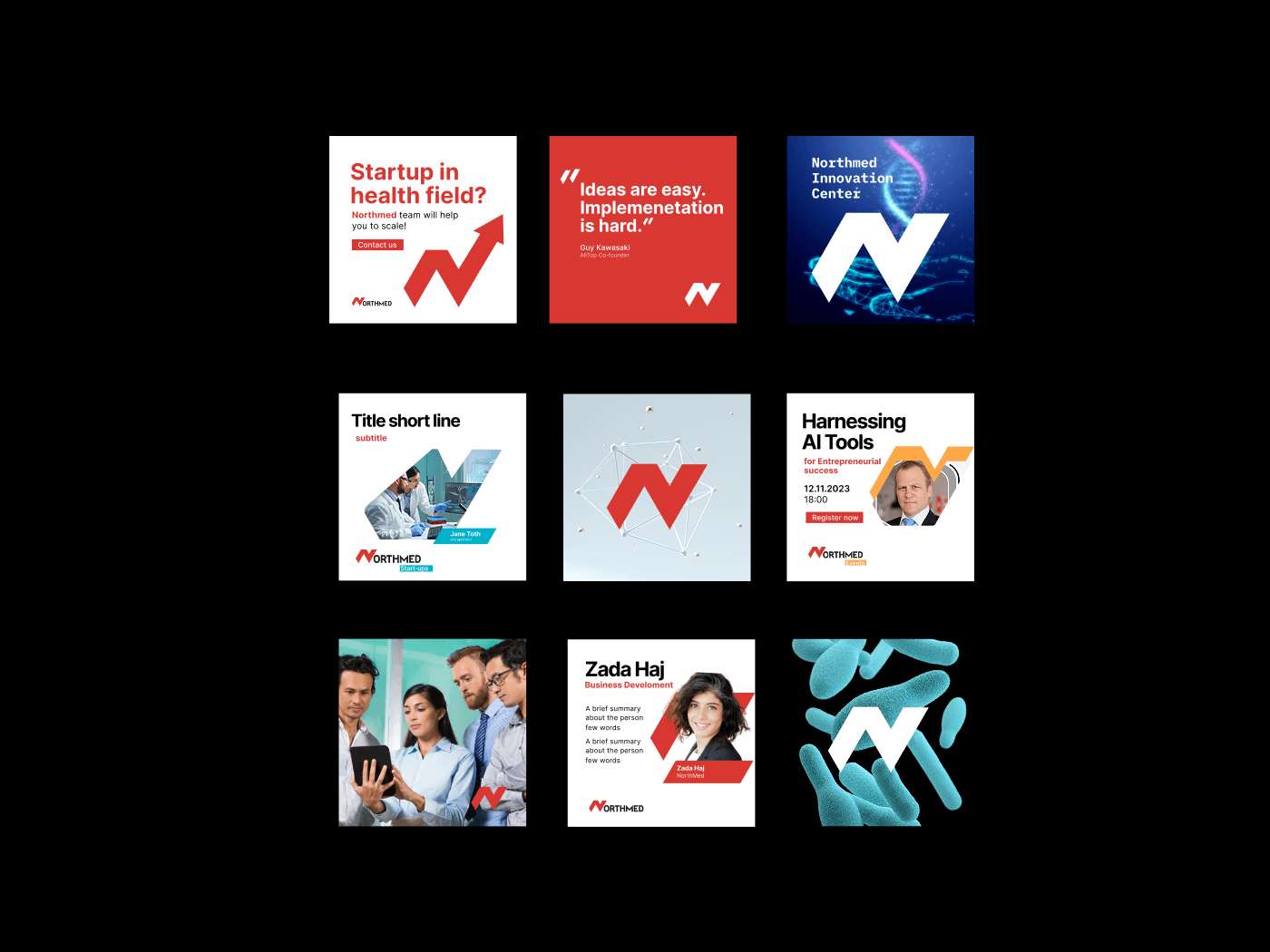
NorthMed social media template system — event announcements, team introductions and quote cards built on one flexible grid
A template system, not one-off posts
Events, team introductions, quotes — every post format derived from the same rules.
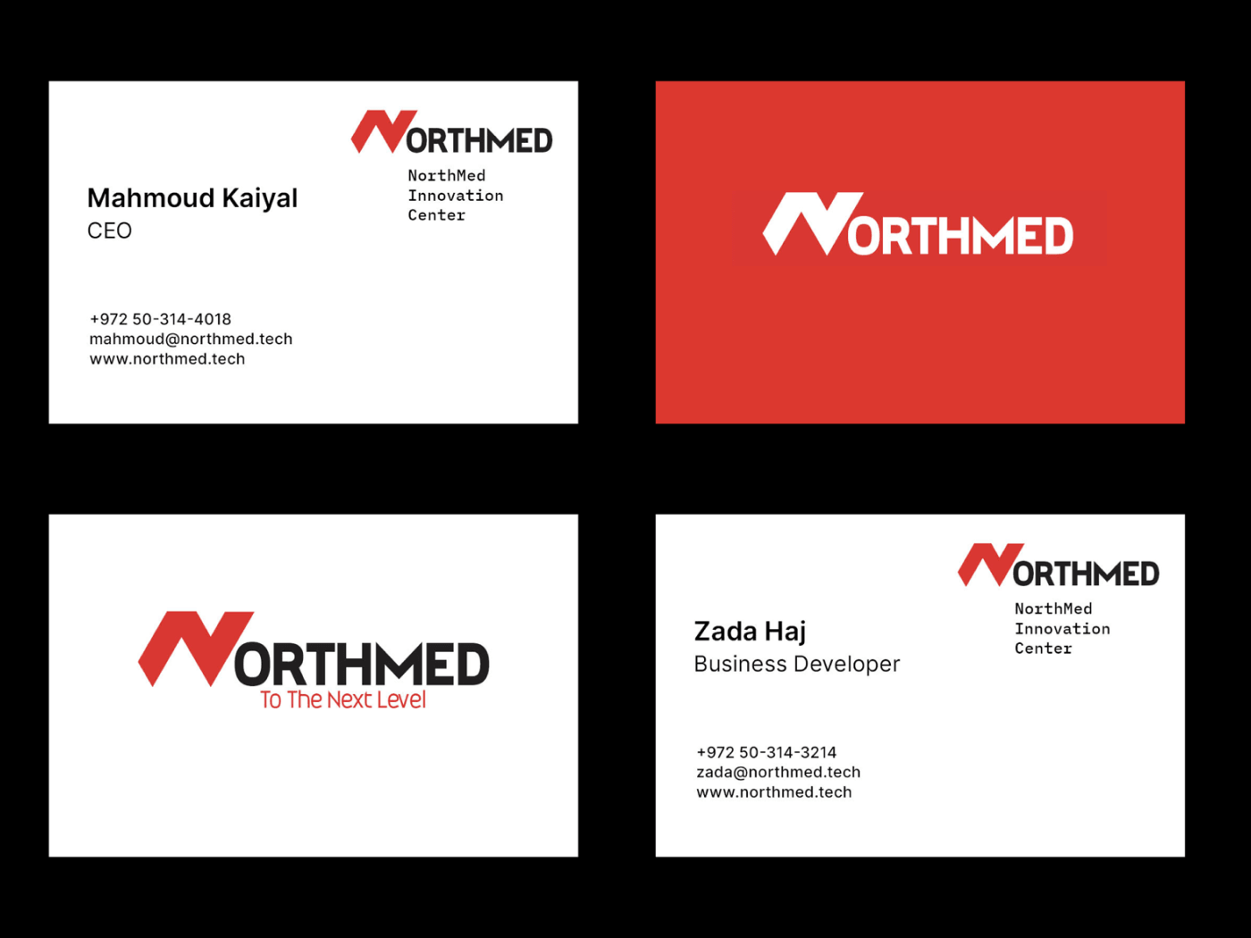
NorthMed business cards and stationery — brand identity applied to print collateral
In the hand
Stationery and print collateral.
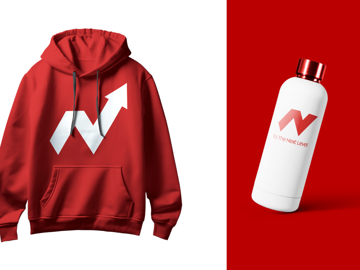
NorthMed branded merchandise — hoodie and water bottle carrying the brand mark
On the team
Merchandise for events and everyday use.
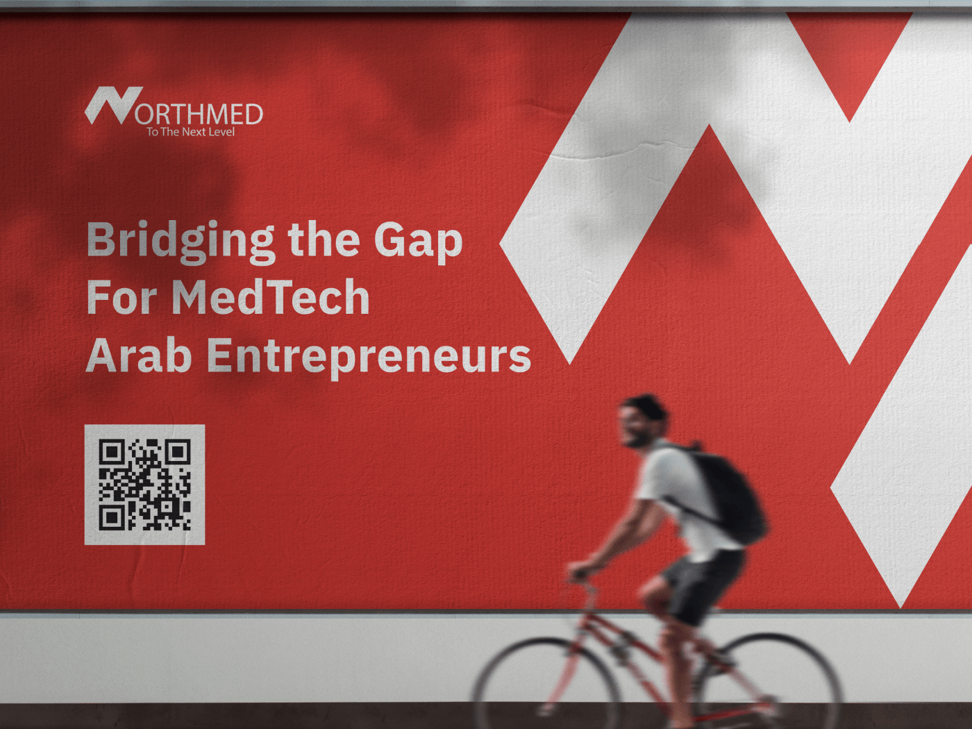
NorthMed outdoor billboard — Bridging the Gap for MedTech Arab Entrepreneurs, the brand mark at street scale
At street scale
Out-of-home campaign — the mark holding its own from across the road.
05 — The Results

They started with a logo. They ended with a brand.

Extended brand guidelines covering print, digital and spatial applications
A complete icon system derived from their own symbol
Offices whose environment communicates the company's work
Conference collateral and derived identity systems for meetups and events

The effect was close to immediate. The team described it as a revitalization — the company suddenly felt as serious and professional as it actually was. That confidence compounded: you organize industry events differently when your presence in the room matches your position in the field.

And the test I care about most came after handover: the team began customizing and extending the system themselves — new spaces, new applications — using the guidelines. A brand system succeeds when the designer becomes unnecessary.

Branding is the gap between how you think you're perceived and how you're actually perceived.

— The conviction this project crystallized
More Work

Two more decisions, two more systems.

Have a logo and nothing around it?
Let's build the system

I take on a small number of strategy & identity engagements for companies in fintech, medtech and civic tech.