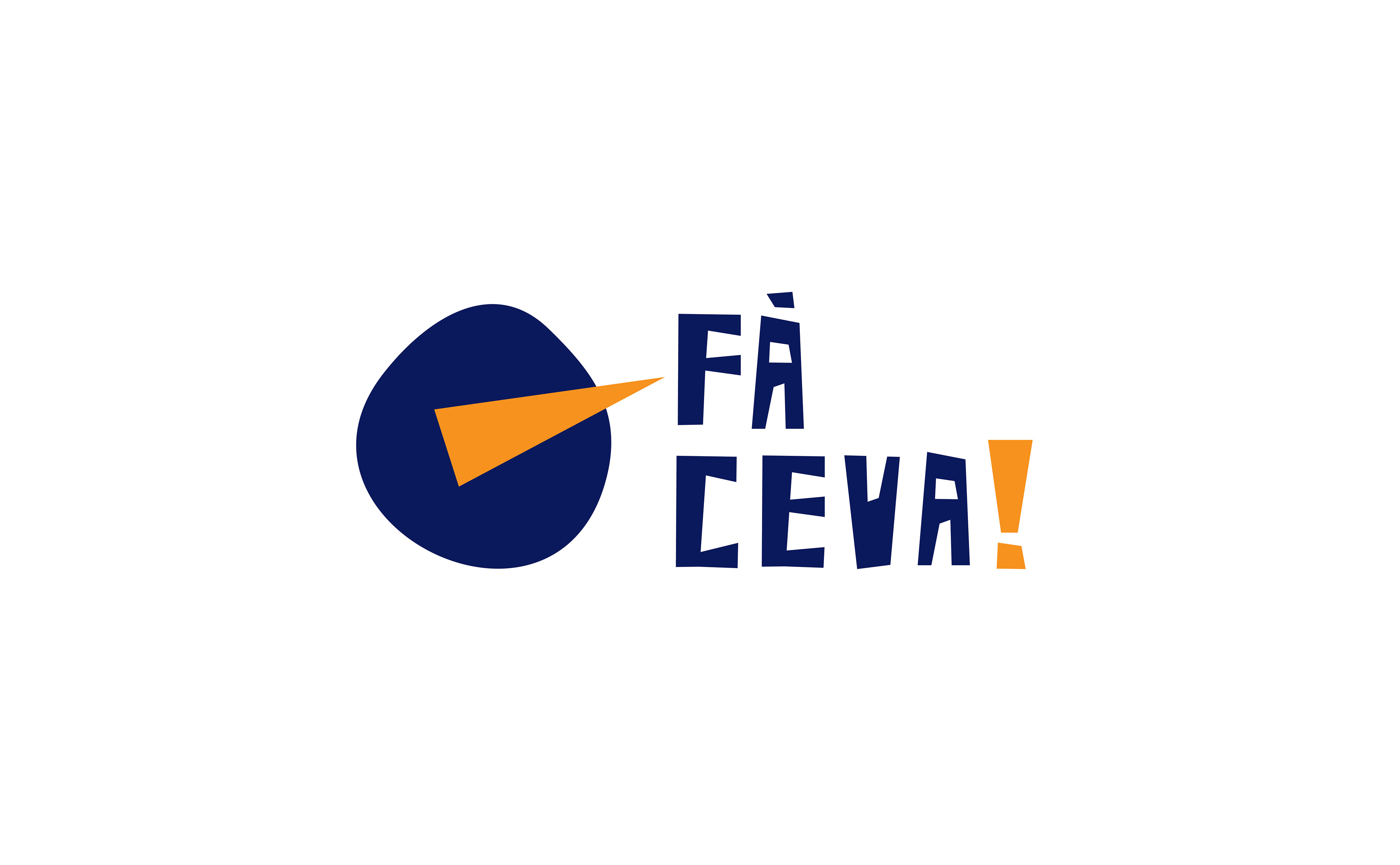
Fă Ceva! > Visual Identity for a Social Campaign
Fă Ceva! – meaning „Do Something” s is a visual identity for a social awareness campaign who start the activity in 2019, in Bucharest, and the main goal is to fight childhood obesity.
Being present as an awareness campaign against this topic is already a plus in a context where childhood obesity is a marginalized subject, even the situation is very serious. Still, there is a need for a dynamic identity something to stand out and get the attention of millennial parents
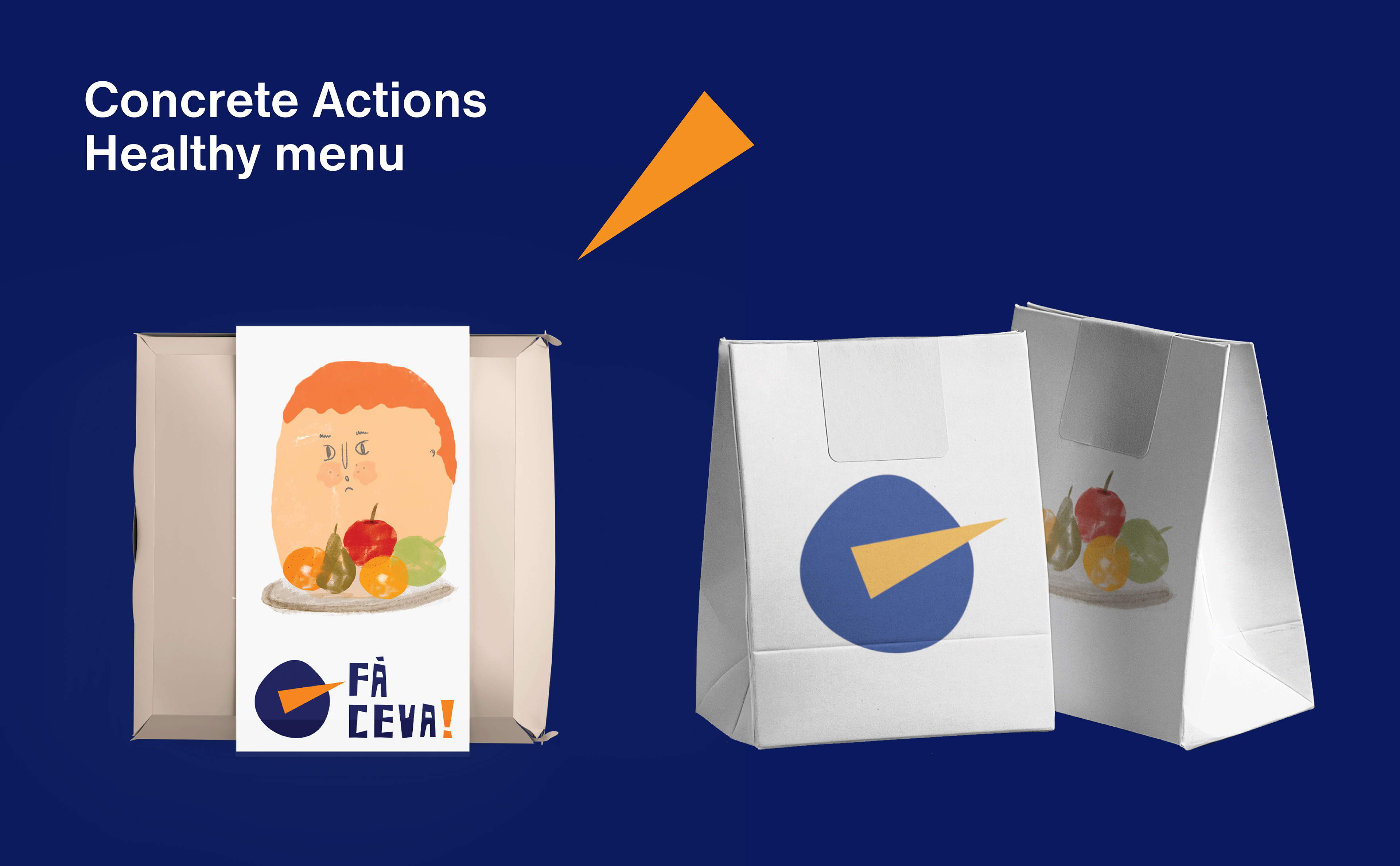
The goal was to provide a visual identity mainly to get parents attention, but also to be kids friendly, something that could help the public to engage and take actions.
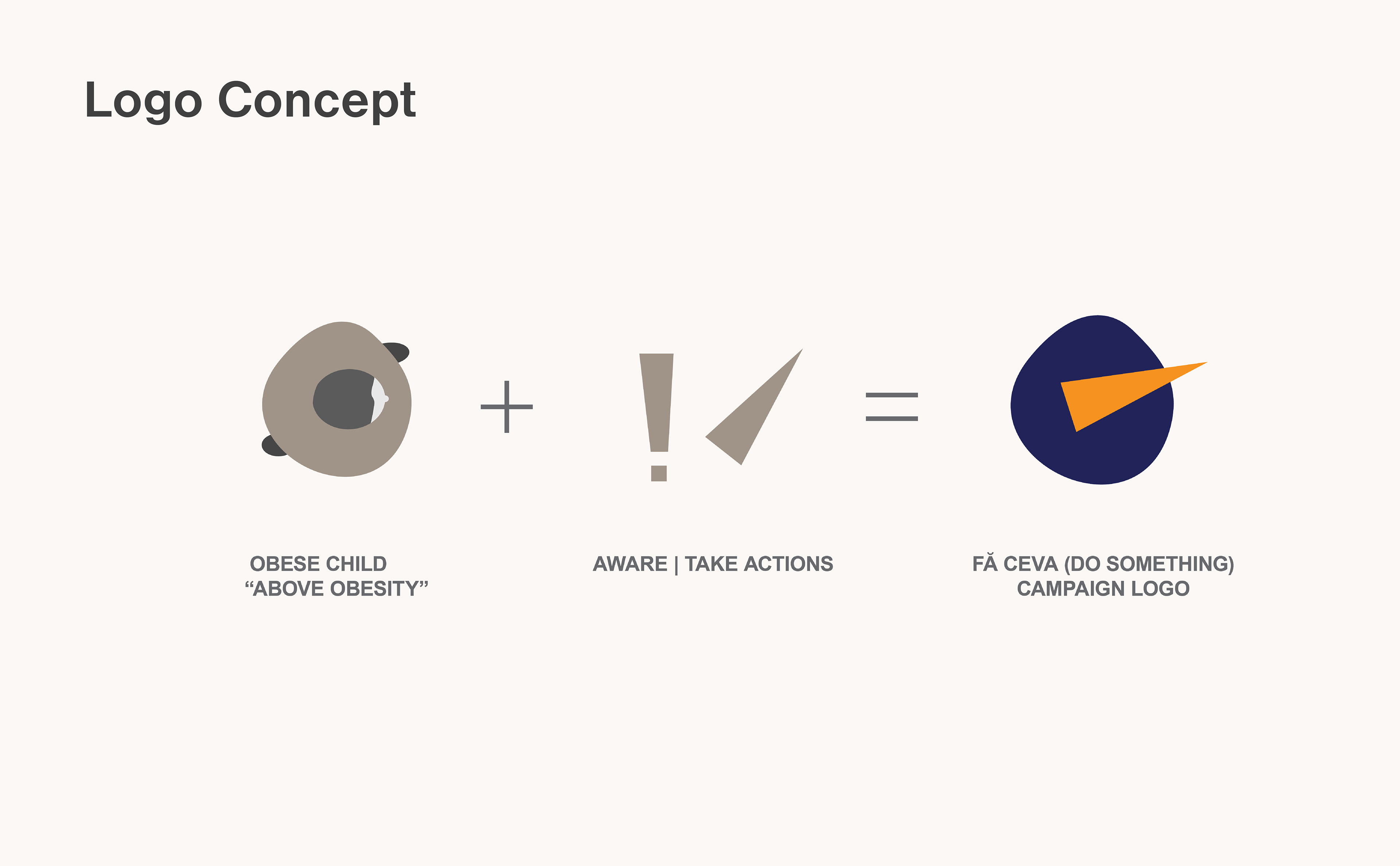
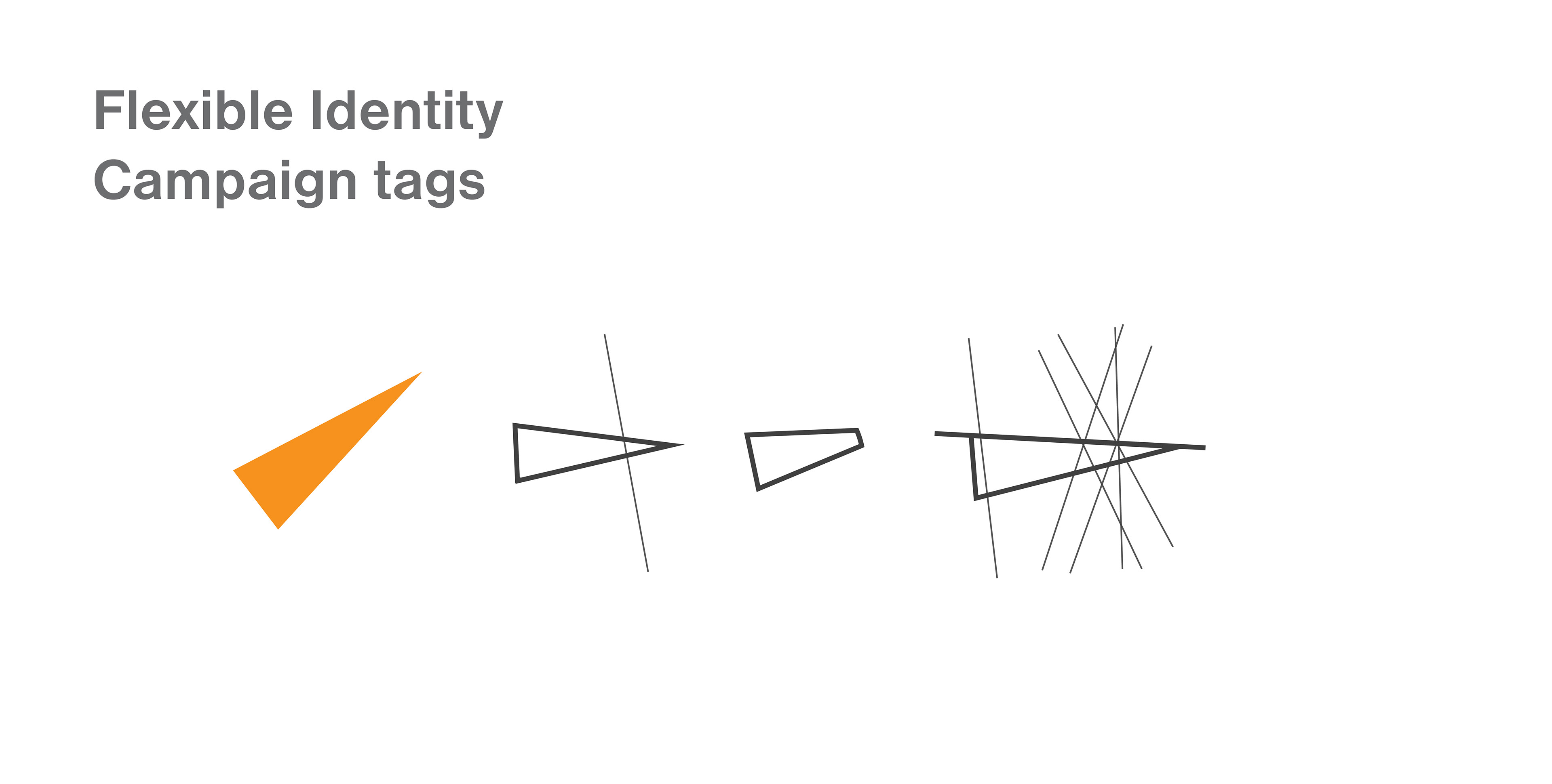
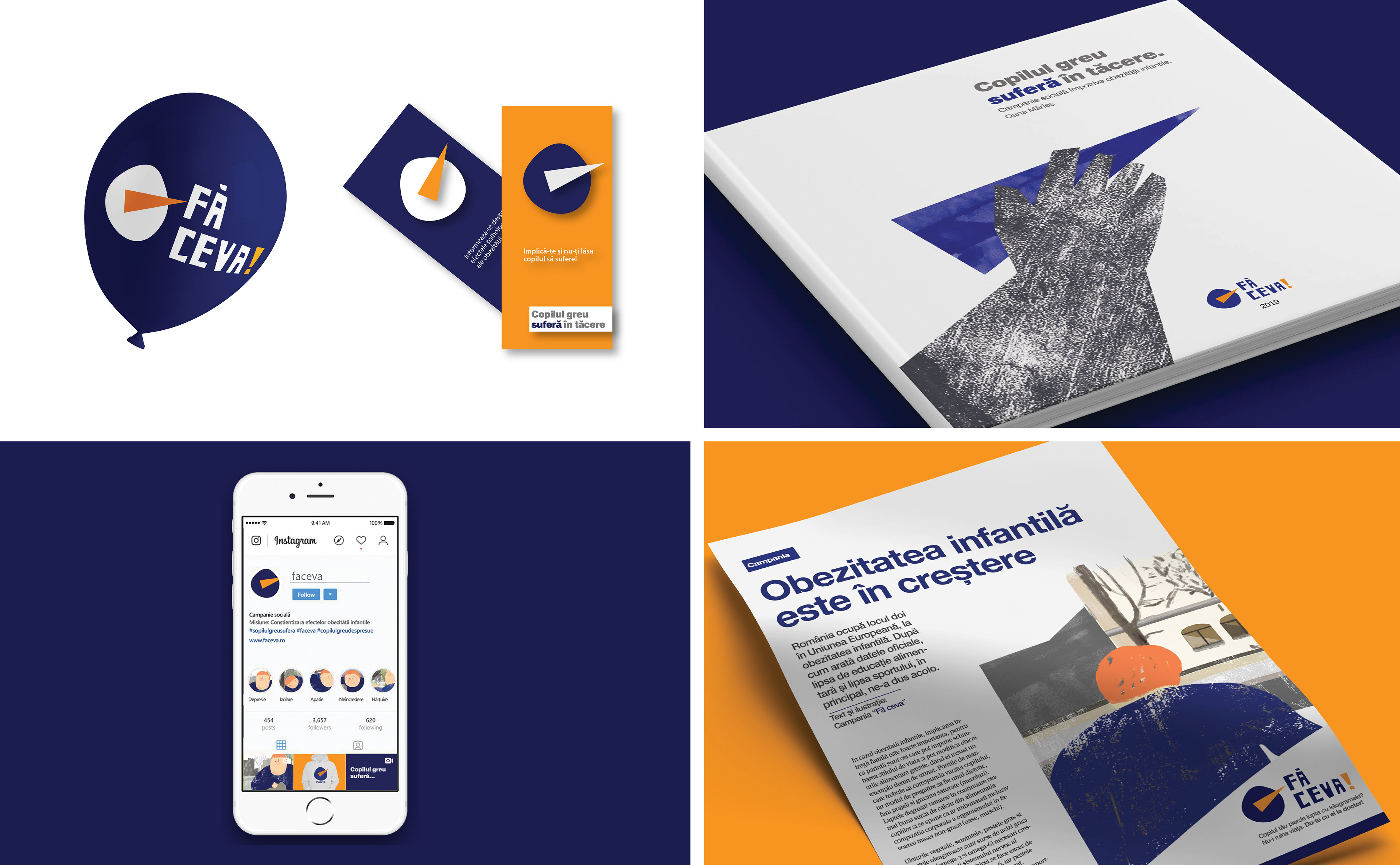
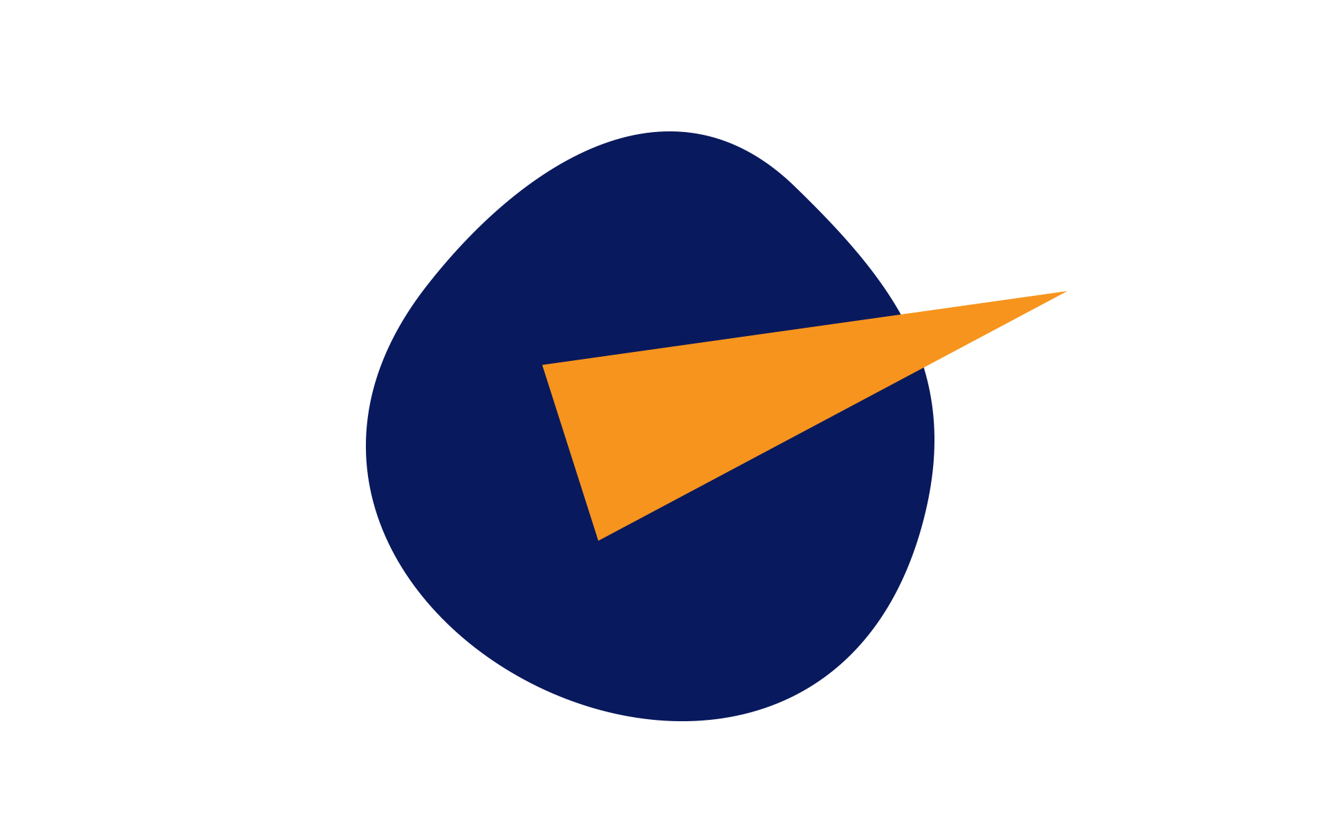
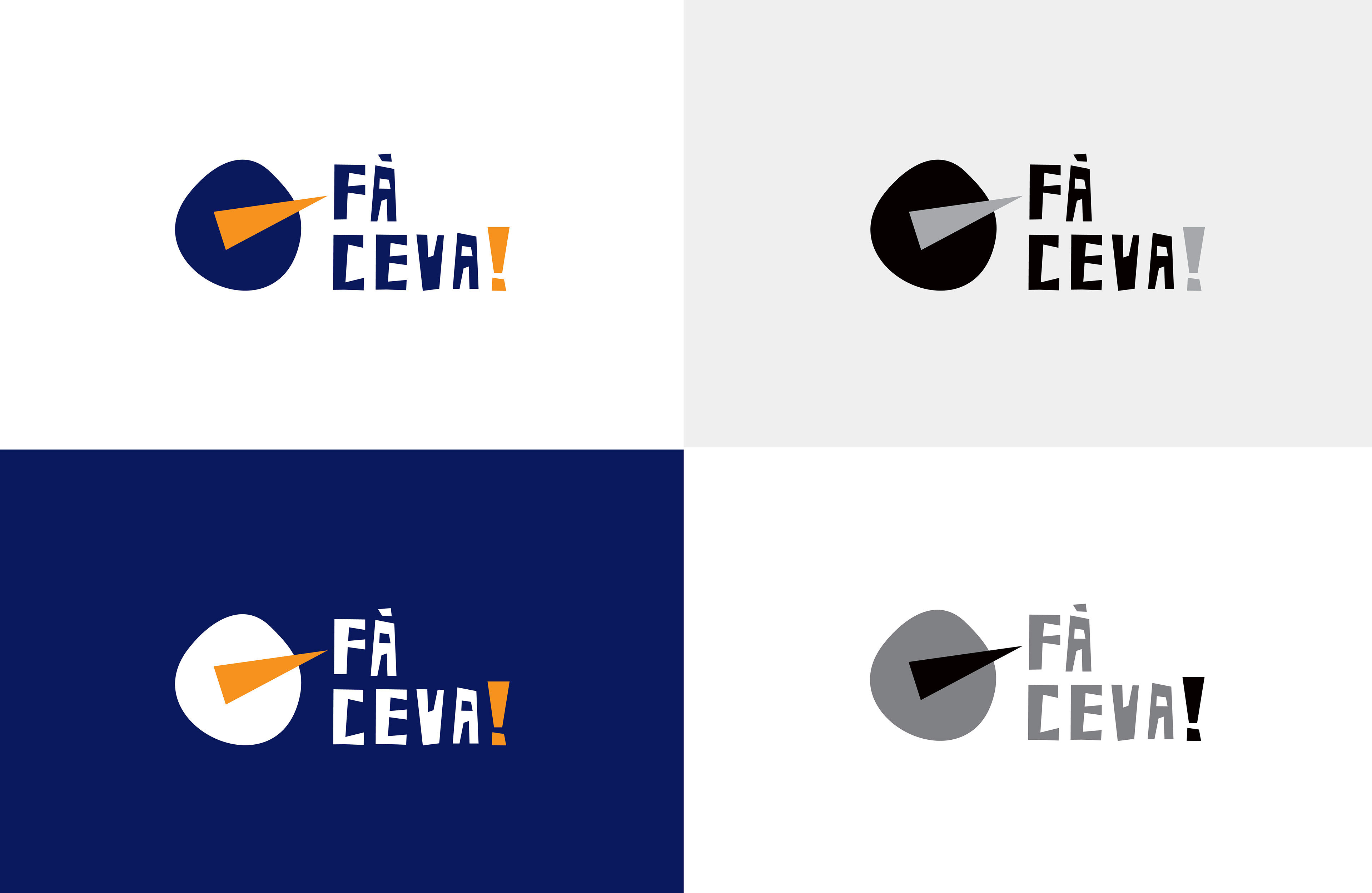
The logo is designed starting from the “beyond- above obesity” and as a reference is inspired by an obese persona viewed from the top. The resulted shape is organic become through motion fluid and relative like obesity.
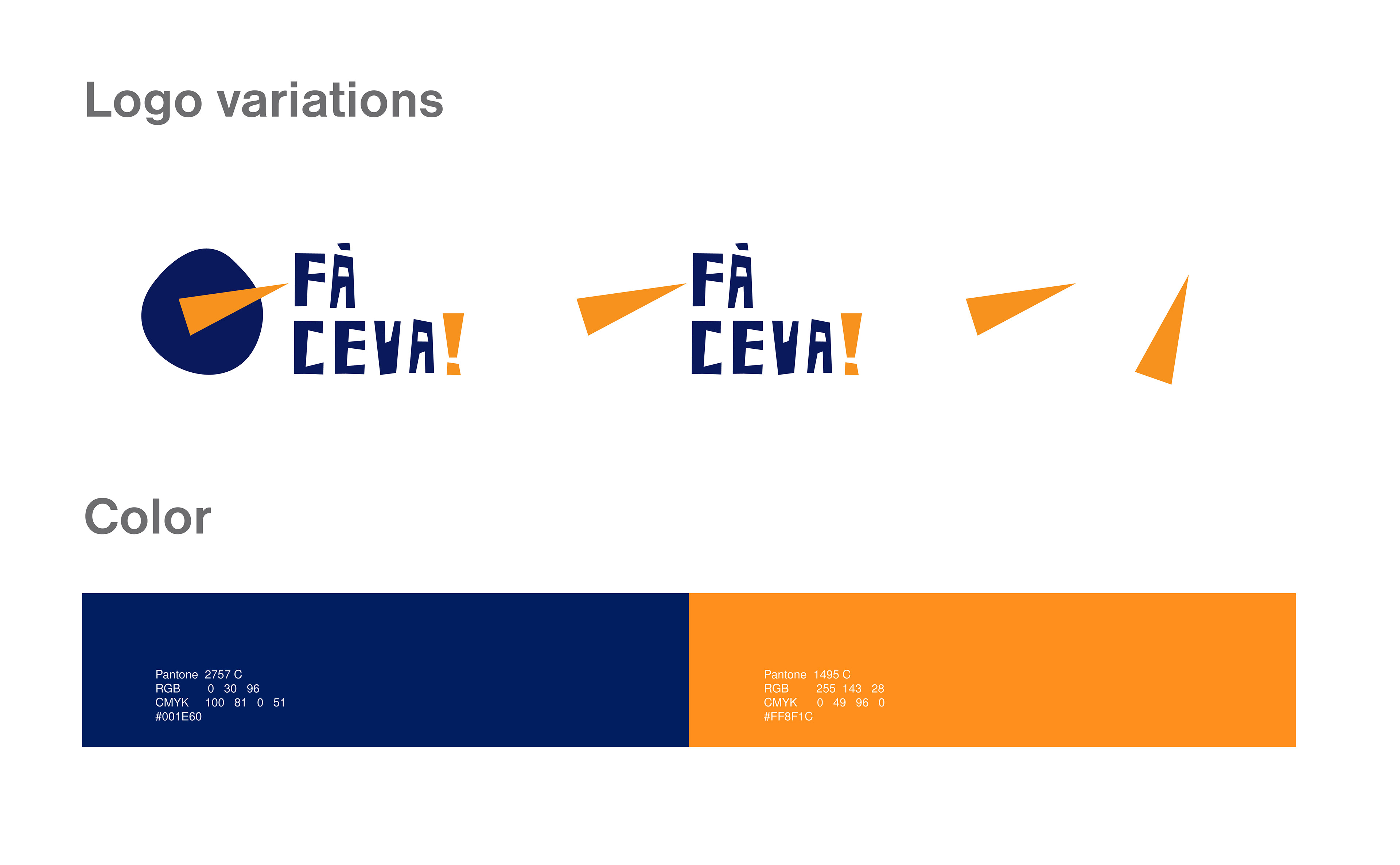
The orange accent of colour is based on an indicator as a direct suggestion for a call to action, This, also have a dynamic potential to indicate the right way to go. The letters used in logotype are edgy and highlight the tense of this issue.
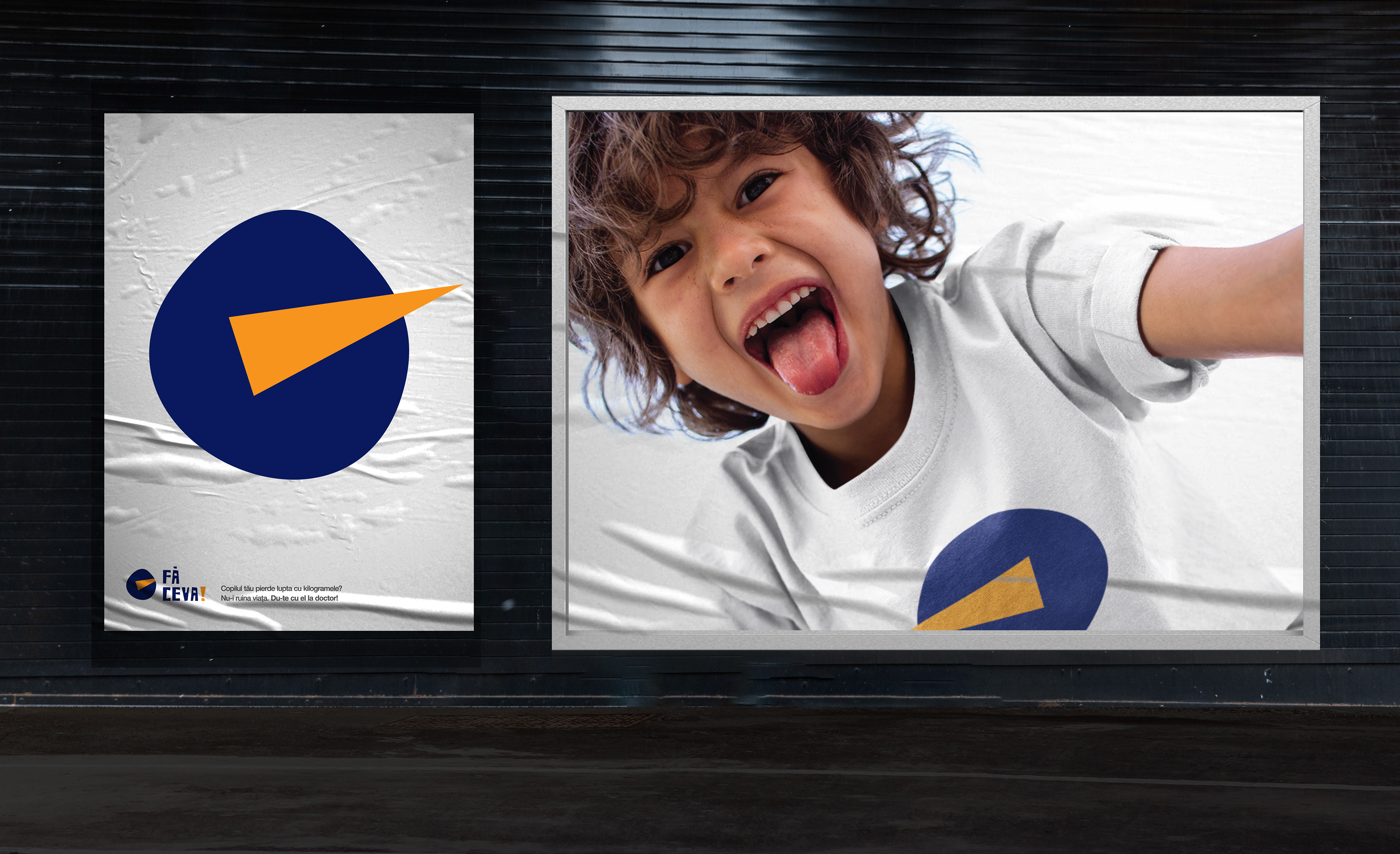
The campaign „Fă Ceva” was planned to be implemented in two directions:
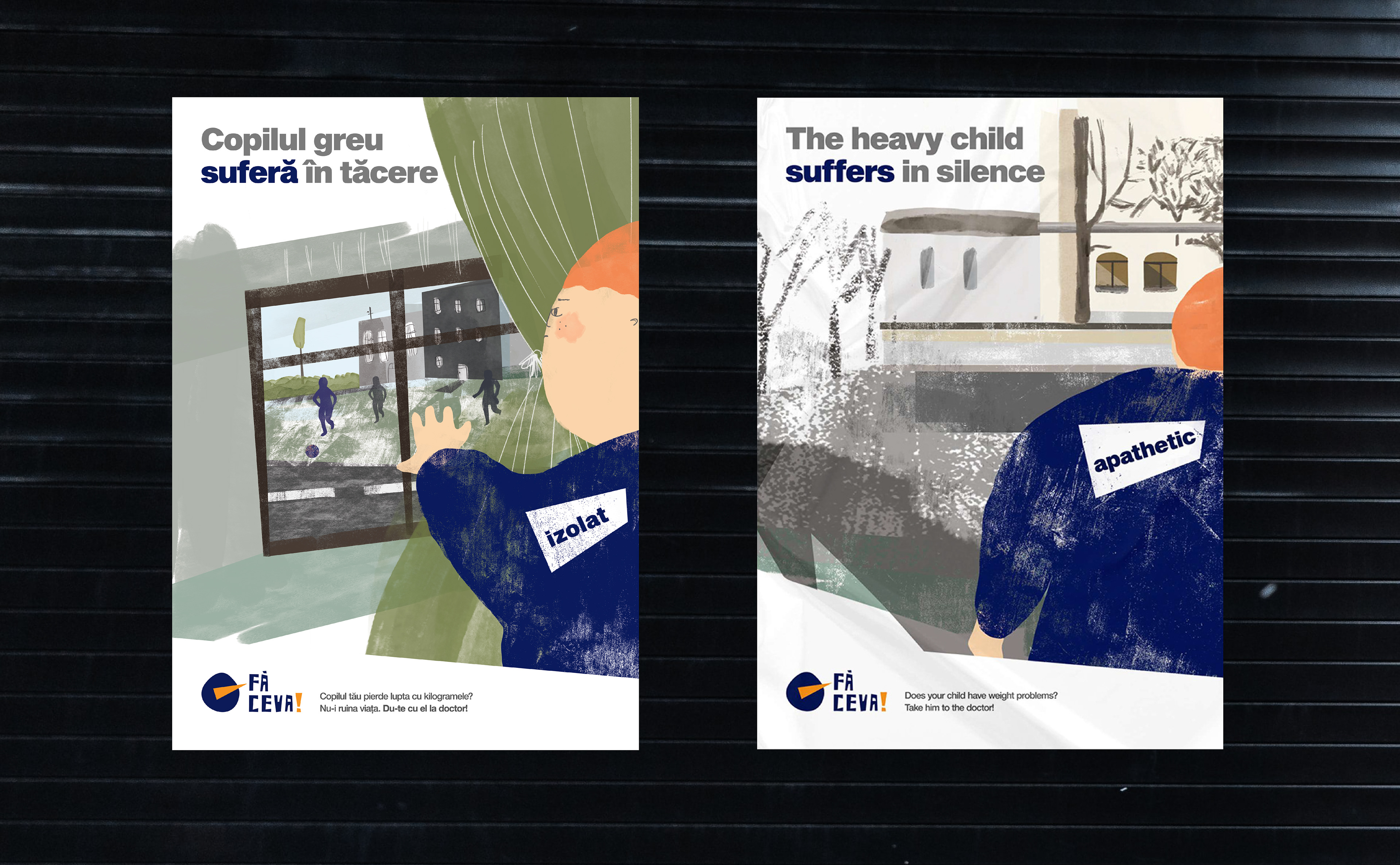
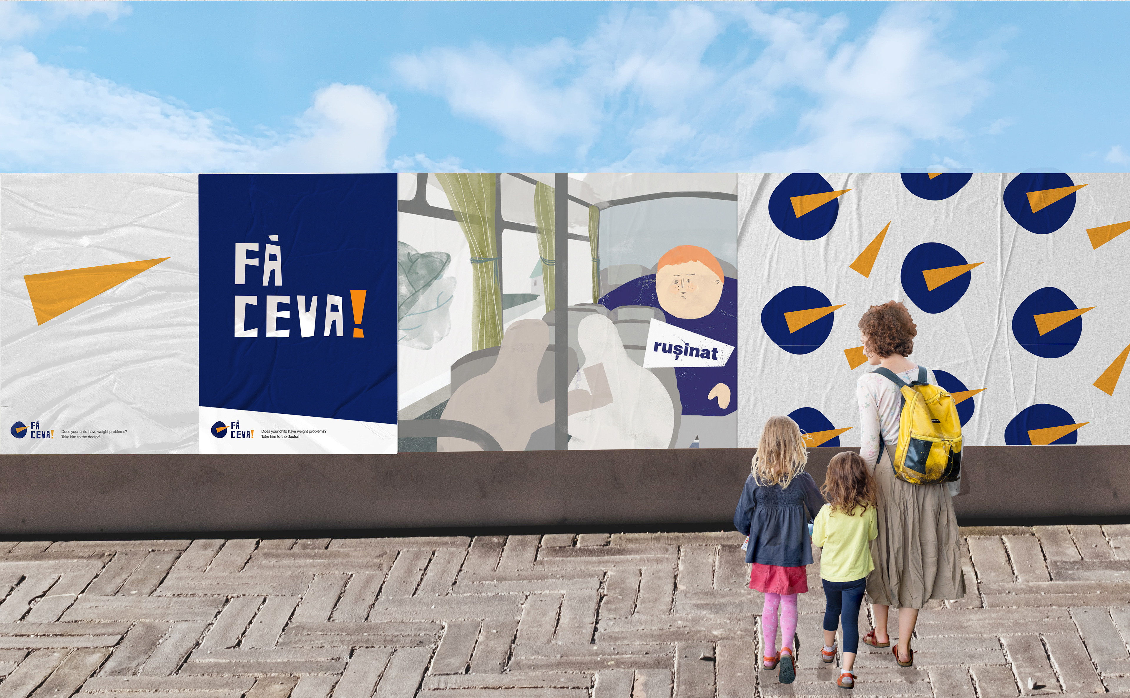
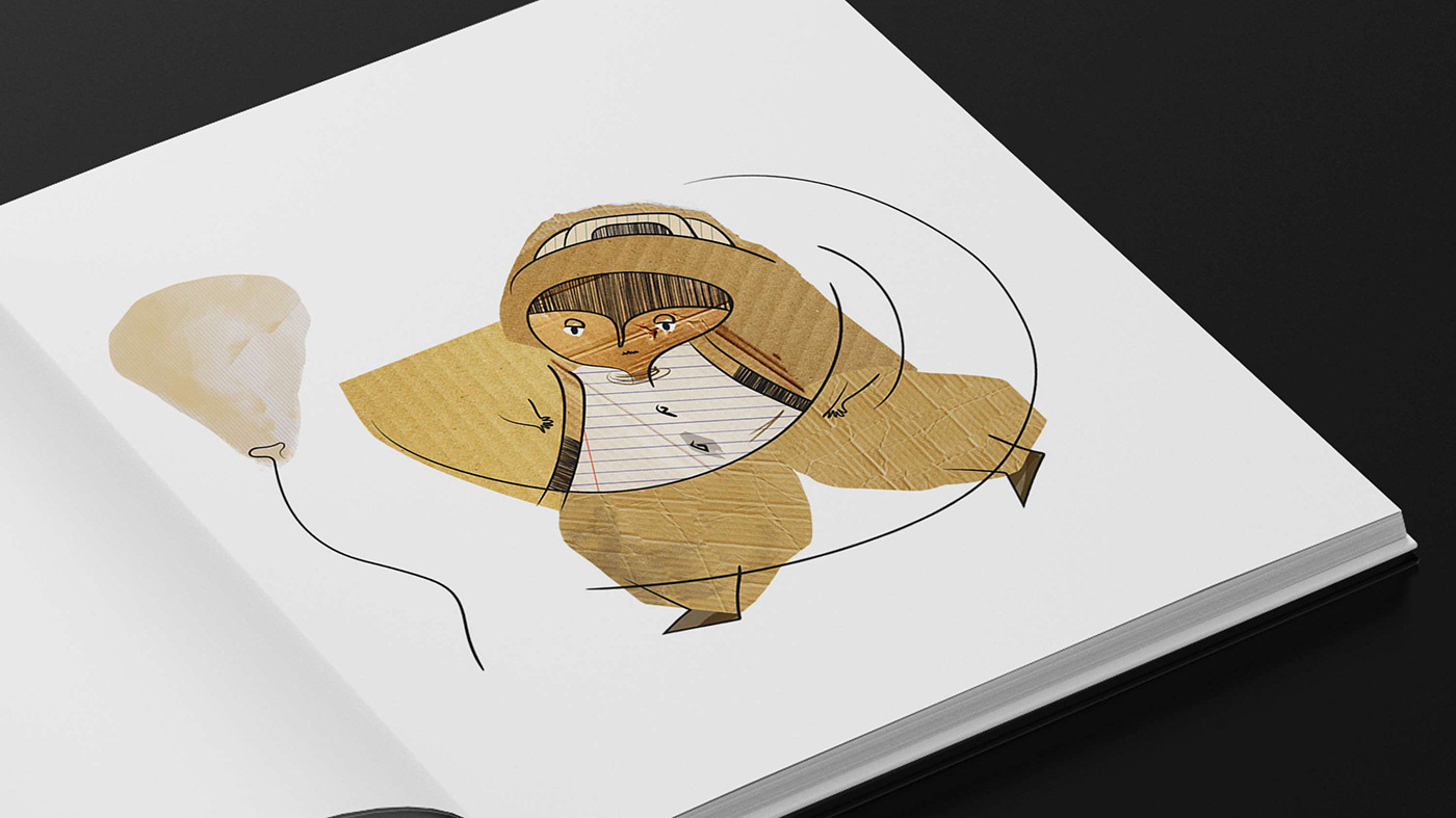
1. An awareness campaign where the ads included a serial of visuals using contemporary illustrations to show the effects in childhood obesity beyond what is obvious - focusing on the psychological, emotional aspects - obese kids many time are suffering for bullying, rejection, isolation etc.
You can find it here: https://www.behance.net/gallery/89475347/Childhood-Obesity-Awareness-Campaign
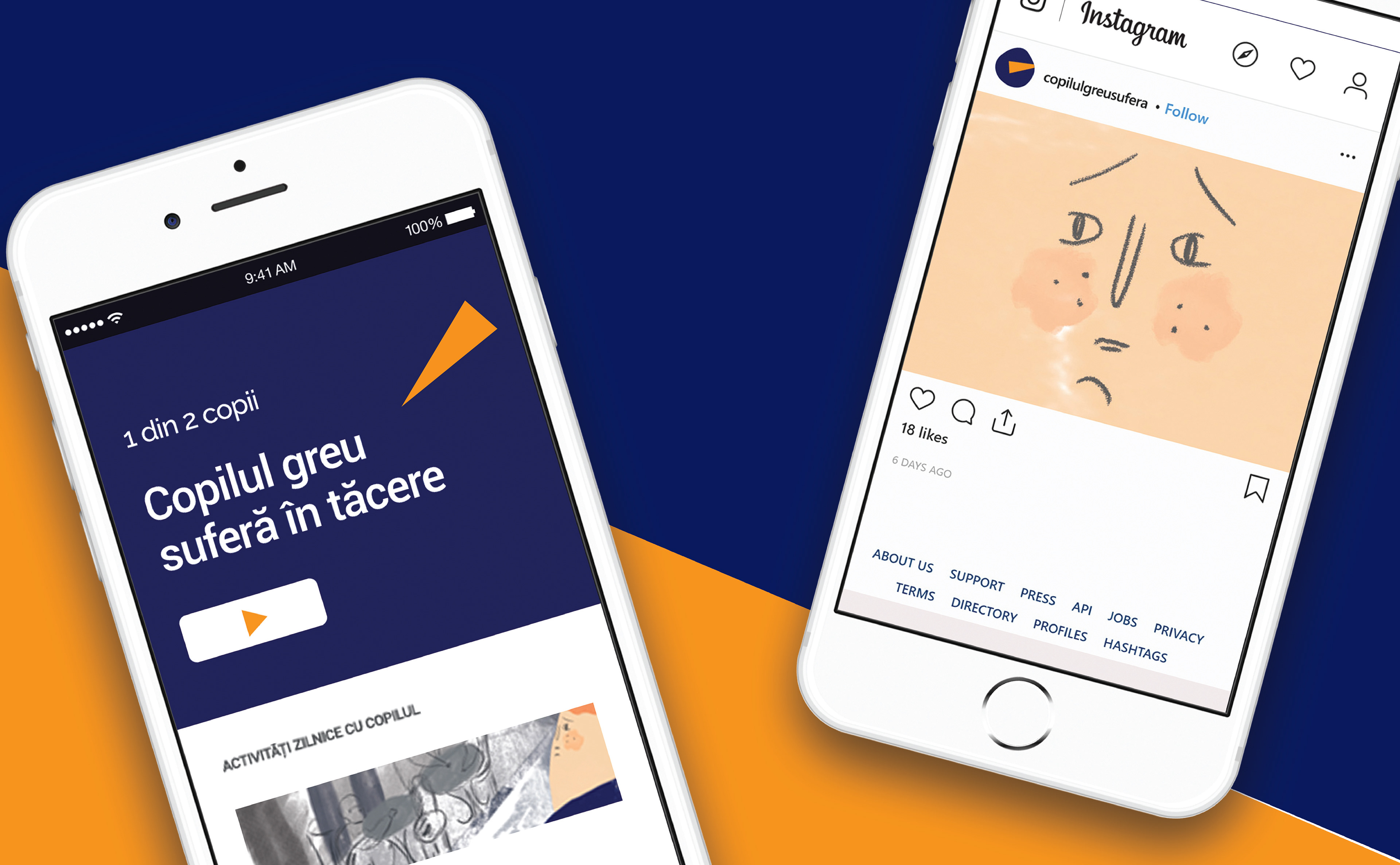
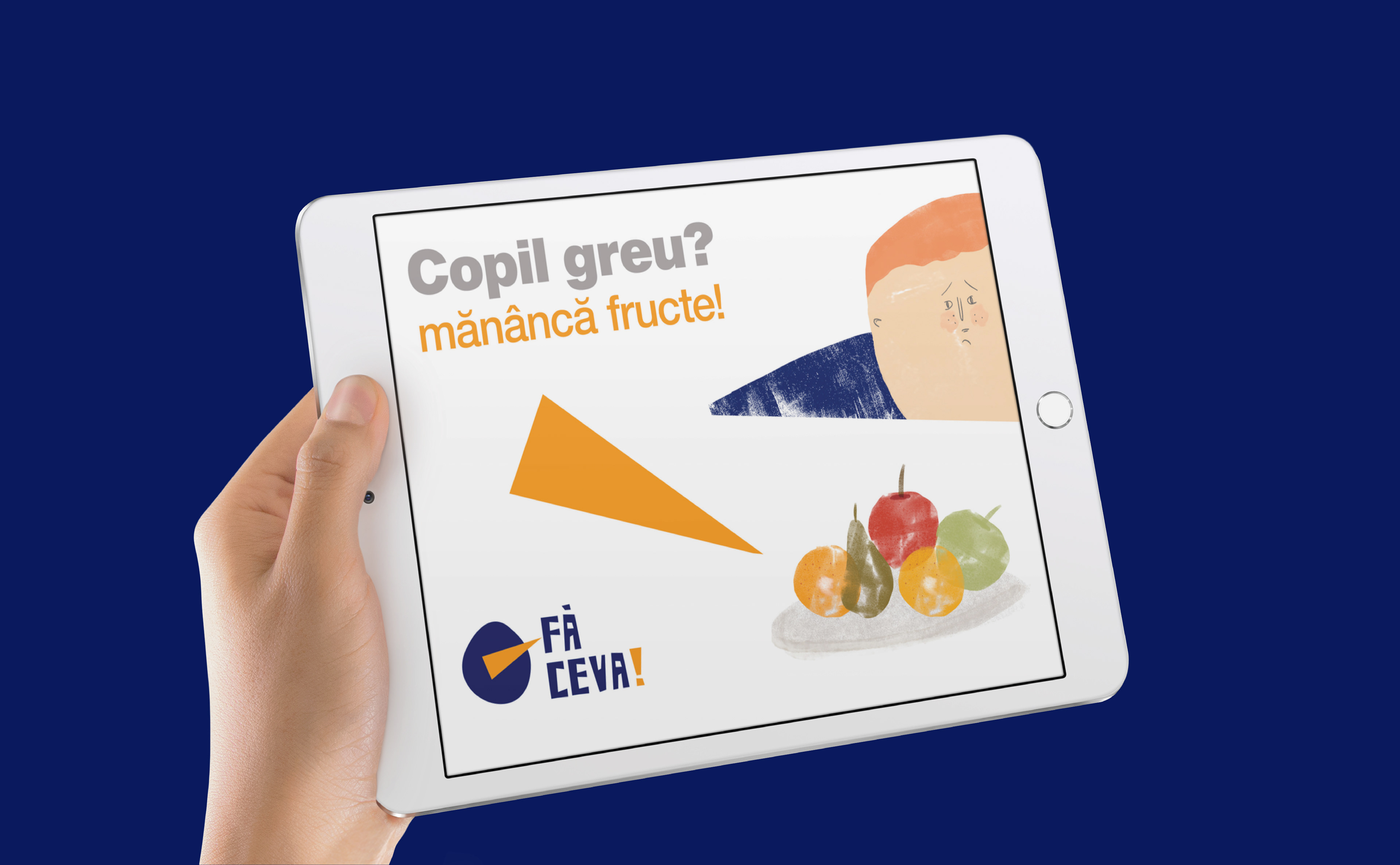
2. Call to action campaign, spread also in online and social media where parents could get advice and they could understand through interactive visuals what it is the impact of the issue on the long term.