© Case StudyDisinfo Radar — Research

A radar for fake news, drawn as a single letter

Disinfo Radar researches the newest online disinformation threats — the tools that produce them, the tactics that spread them, the stories that carry them — and helps society recognise and react to them. The identity puts all of that into one mark: a radar that is also the letter "O" of the name, with an orange focus point at the centre and invisible axes that rotate to give each of the three pillars its own version.

Client
Disinfo RadarCounter-disinformation research project
Sector
ResearchDisinformation monitoring · Media resilience
Year
2024Full identity system delivered
Disciplines
Brand identity & systemSymbol system · Colour & type · Guidelines

Disinfo Radar brand symbol — a white radar ring with a centre focus dot, on a deep blue fluid background
01 — Context

New disinformation threats appear faster than people learn to spot them.

Disinformation keeps changing form: new tools produce it, new tactics spread it, new stories carry it. Disinfo Radar was set up to track exactly that — evidence-based research on the newest online disinformation threats, written for political decision-makers, civil society and the public, and organised around three pillars: Tools, Tactics and Stories.

The project reached me through the team in Berlin I had already been working with — it runs under the Democracy Reporting International umbrella — and it was territory I knew from earlier projects: technology and information, and what disinformation does to both.

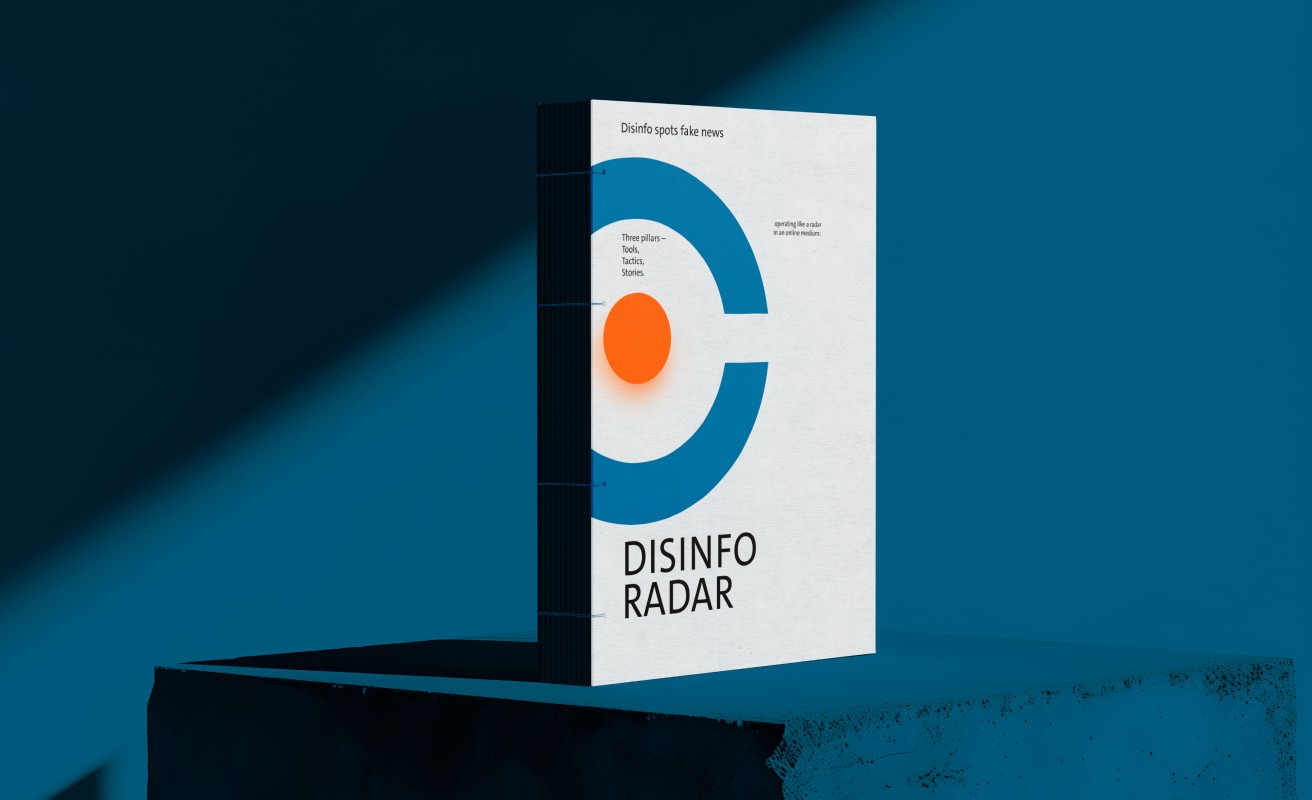
Disinfo Radar report cover — the blue radar symbol with orange focus dot over the wordmark, standing on a blue plinth
The report
"Disinfo spots fake news." The kind of output the identity carries most often — research, in print.
02 — The Challenge

Three directions, one signal — for a threat nobody can see.

Disinformation is hard to brand because there is nothing to show — the threat stays invisible until it has already worked. What the identity could show is the act of detection. And it had to do that in two very different places at once: research reports read by policy people, and social media, where the symbol lives at avatar size.

It also couldn't point in one direction. The project works through three pillars — Tools is the technical, digital side; Stories covers the narratives; Tactics, the methods that spread them. Three workstreams that needed to stay one recognisable brand, not three.

03 — The Strategy

If the project works like a radar, draw the radar.

Vigilant, open, and focused on the purpose.

During research I kept coming back to maritime navigation radars — the systems that monitor naval traffic in real time. The analogy fit the project precisely: Disinfo Radar doesn't watch a single channel. It scans continuously, in three directions at once, the way a radar sends its waves out and keeps extending them.

So the symbol is drawn from standard navigation radar — the state the screen shows when the radar is on. At the same time it reads as a letter, and sits inside the logotype as the "O" of Disinfo. The name and the symbol carry the same idea.

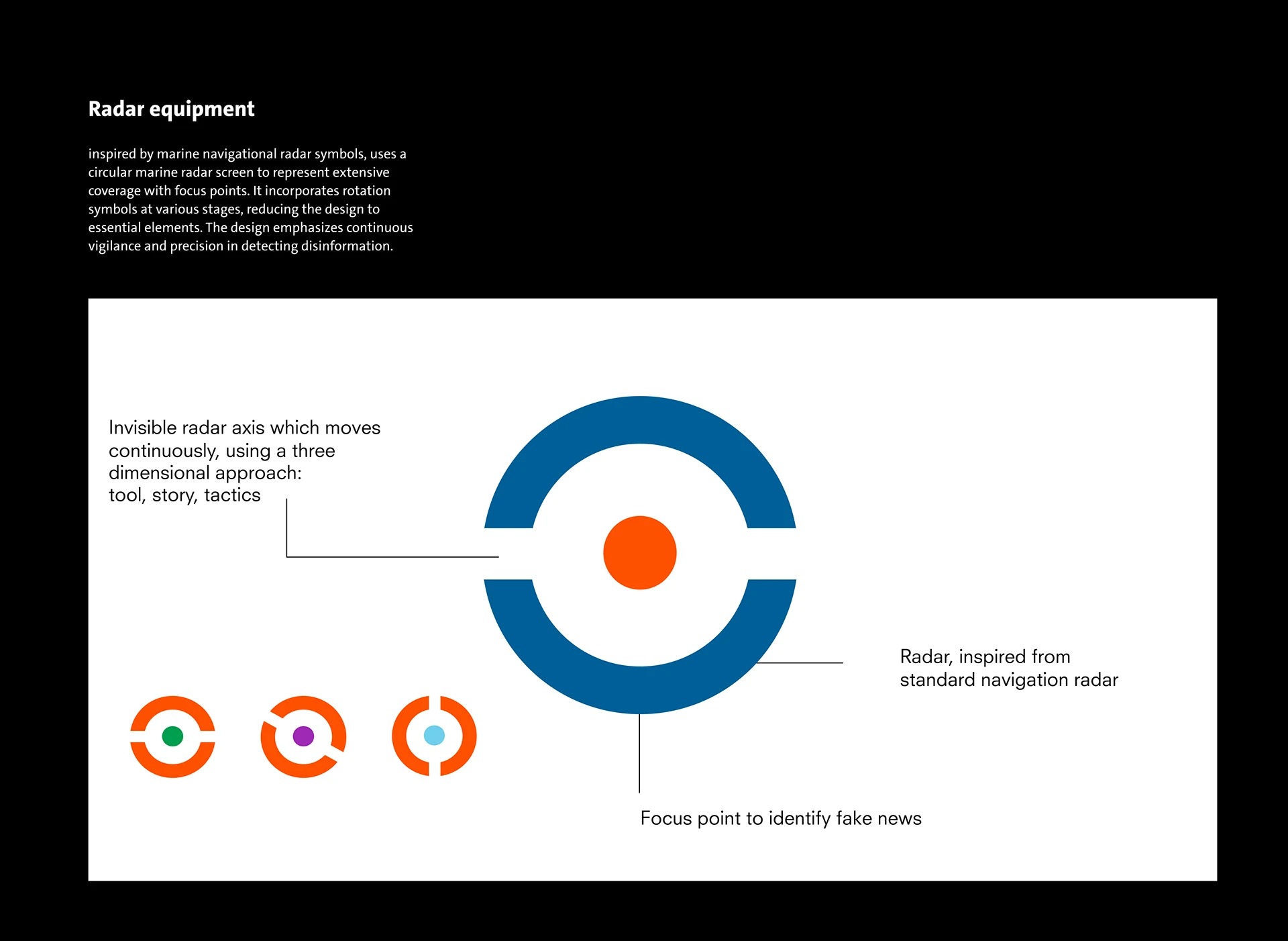
Disinfo Radar symbol anatomy — the radar ring annotated: invisible moving axes for the three pillars, the navigation-radar reference, and the focus point that identifies fake news
The anatomy
A radar inspired by standard navigation radar; invisible axes that move through three positions; a focus point to identify fake news.
04 — The Work

The radar, turned into a system.

01

A radar drawn as a letter — with its axes left invisible.

The cuts in the ring are the radar's invisible axes — the lines the axis draws as it turns. The dot in the centre is the focus point: the moment fake news gets identified on the screen. It's orange because the organisation heading the project sits, literally, at its centre — the accent colour marks that. The construction is fully geometric, and it stays legible at very small sizes, which matters for a brand that spends most of its life on screens.

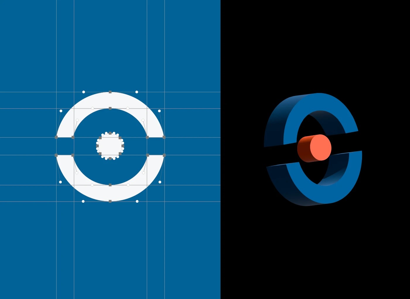
Disinfo Radar logo construction — the symbol on its geometric grid, next to a 3D render of the radar ring with its orange focus point
On the grid
The symbol built on its construction grid, and tested as a 3D object.
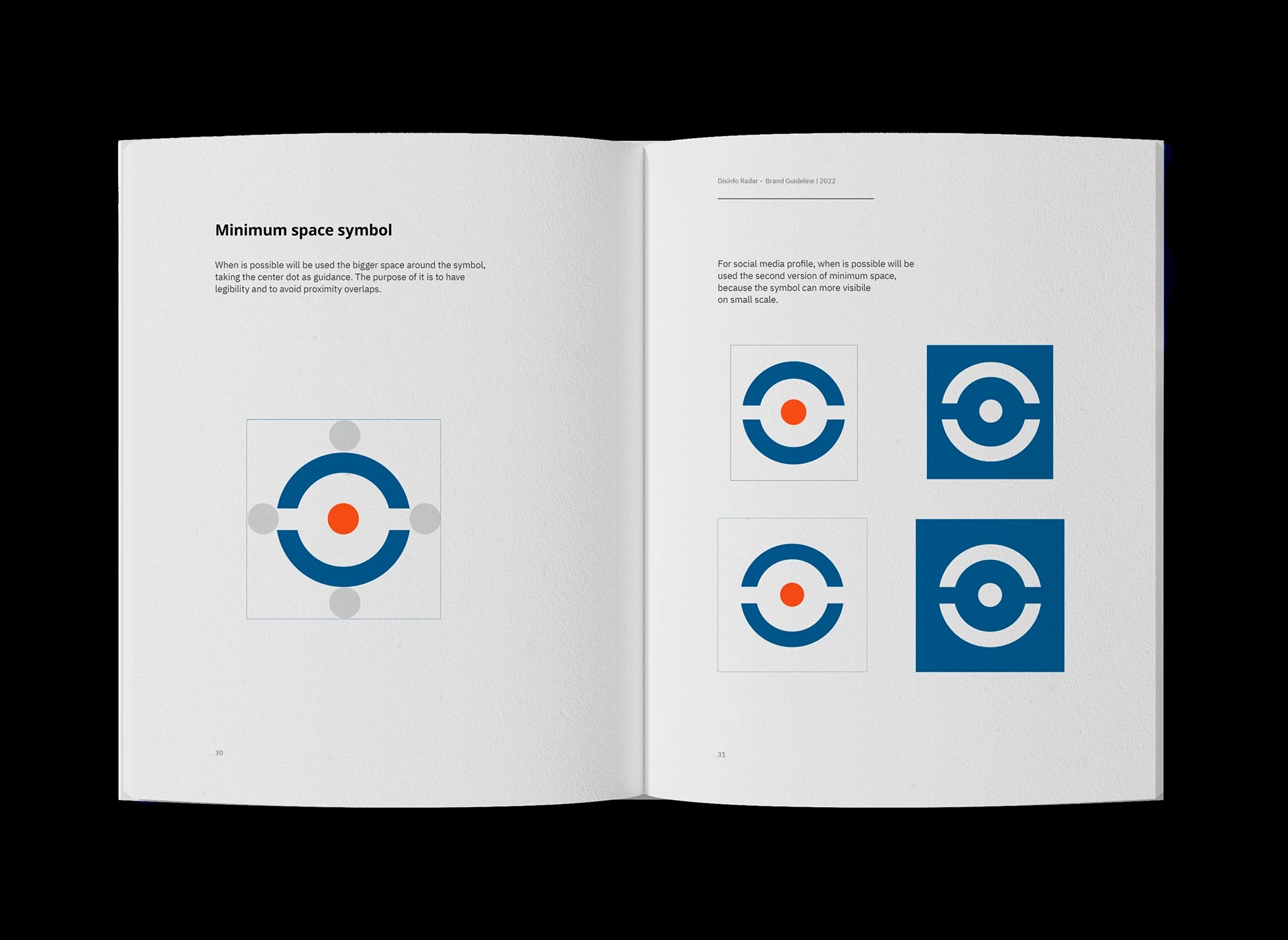
Disinfo Radar brand guideline spread — minimum space and social media crop rules for the radar symbol
Rules for the small screen
Minimum space measured from the centre dot — with a tighter version for social media avatars, where the symbol is smallest.
02

Three pillars, three positions of the axis — one system.

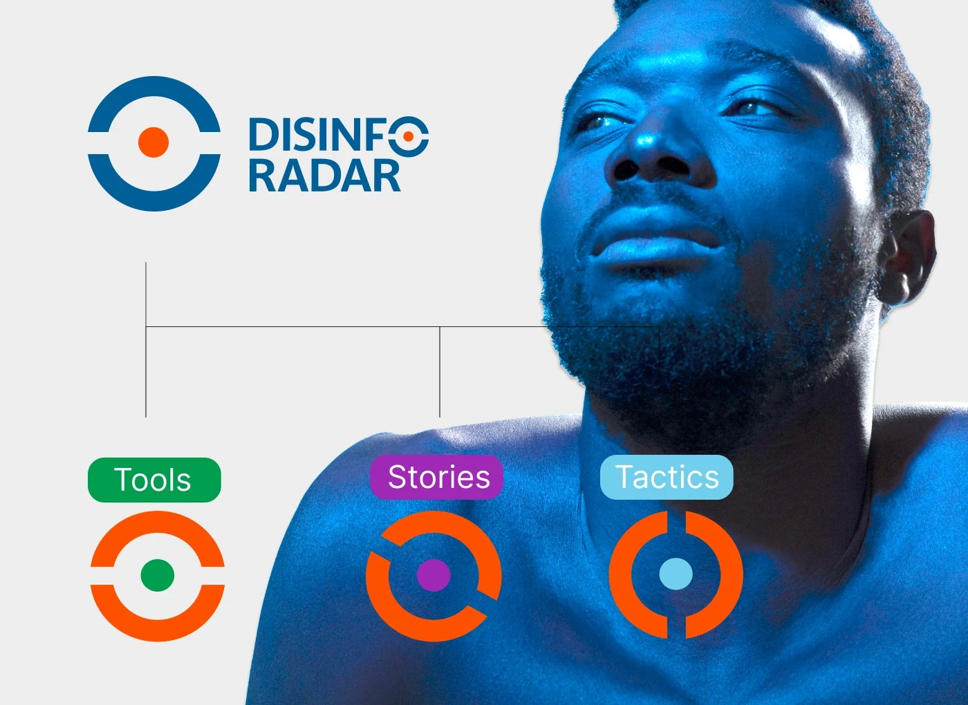
Each pillar has its own version of the symbol: the invisible axis moves to a different position — three rotations for the three directions of the work. The colours switch too. In the pillar versions the ring takes the orange, and the centre takes the pillar's own colour: green for Tools, purple for Stories, light blue for Tactics. You can tell a pillar apart at a glance, and you can always tell it's the same brand, because every version comes out of the same rule.

Disinfo Radar three pillar system — Tools, Stories and Tactics icons, each an orange radar ring with a different axis position and its own centre colour
One rule, three signals
Tools, Stories, Tactics — the axis rotates, the colours flip, and each pillar gets its own individual representation.
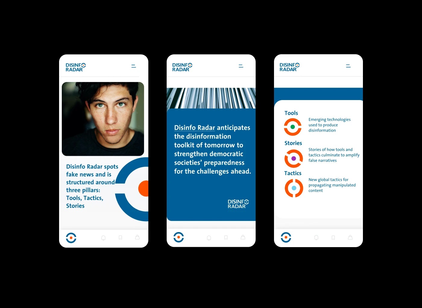
Disinfo Radar mobile screens — the three pillars explained with their icons, and the brand carrying editorial content on a phone
The pillars, explained in-product
Emerging technologies, amplified narratives, new global tactics — each pillar keeps its icon and its colour on screen.
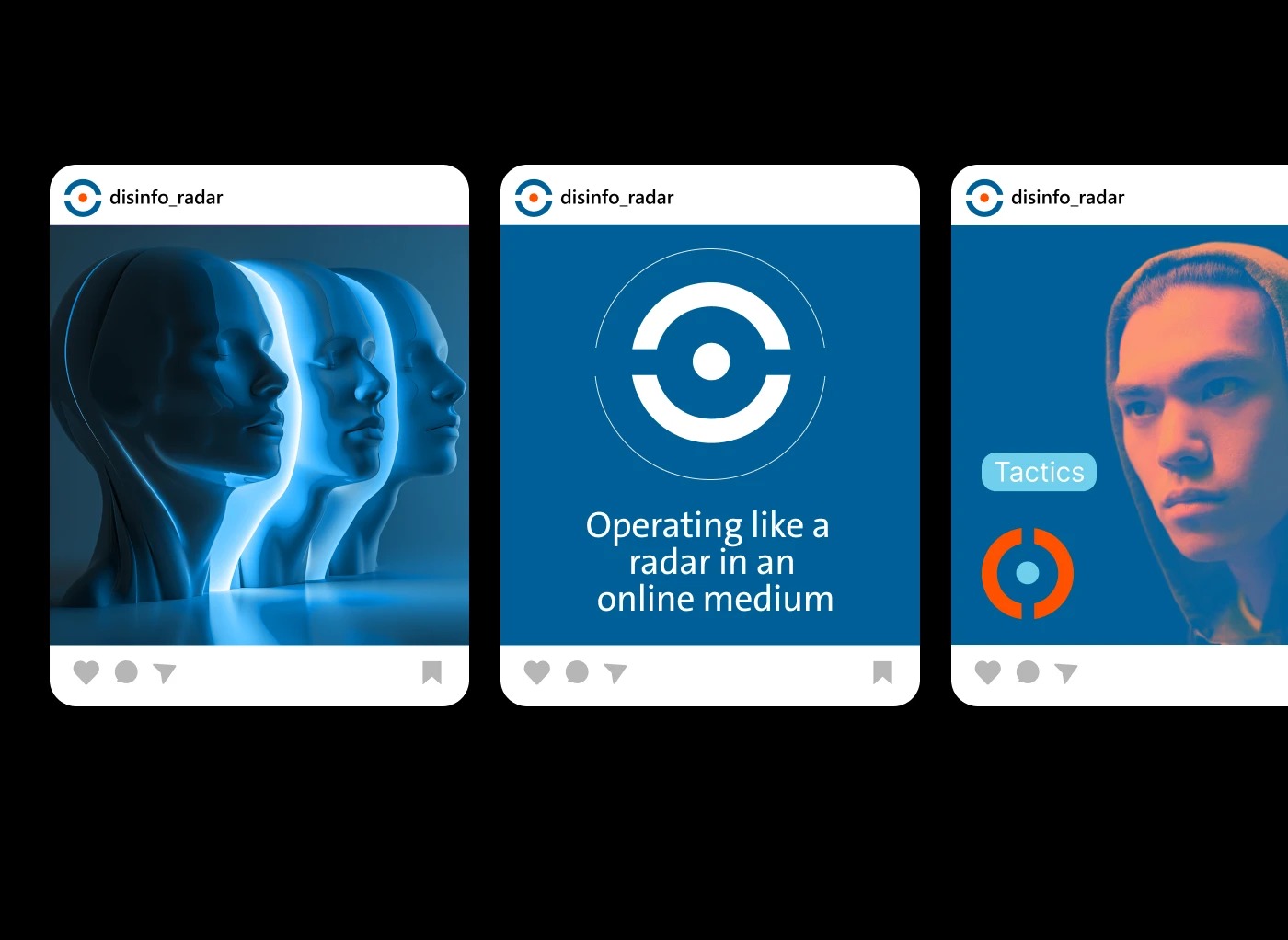
Disinfo Radar Instagram posts — the radar symbol emitting waves, and a Tactics post with the pillar icon over a duotone portrait
Operating like a radar, in the feed
On social, the symbol does what the project does — sits at the centre and sends its waves out.
03

A blue chosen for credibility — and rules for everything else.

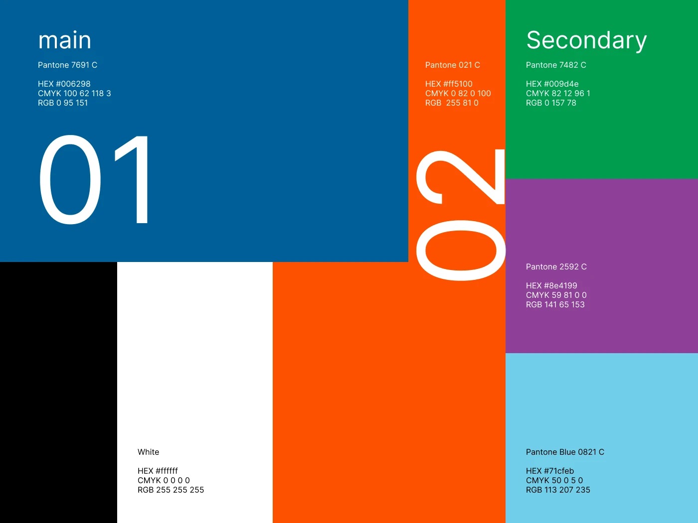
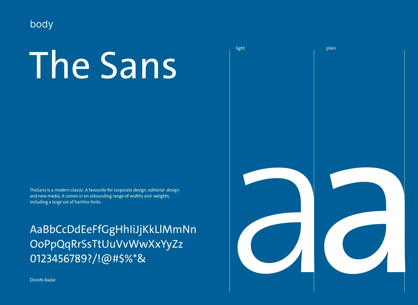
The main colour is a deep blue, Pantone 7691 C — chosen because the first thing this project has to communicate is credibility and safety. On top of it sits one orange accent, the focus point, and the three pillar colours stay secondary. Type pairs TheSans for body text with the condensed Neuzeit Grotesk for headers, on a flexible A4 grid — because most of what this brand produces is reports and briefs. Everything is documented in the guideline book, with monochrome versions, minimum sizes and don'ts, so the team can apply the identity correctly without a designer checking every file.

Disinfo Radar colour palette — main Pantone 7691 C blue, orange accent, and the three secondary pillar colours: green, purple, light blue
The palette, with a hierarchy
Main blue, one orange accent, three pillar colours — each with one job.
Disinfo Radar typography — TheSans typeface specimen in light and plain weights on brand blue
Type that works in a report
TheSans for the long reads, Neuzeit Grotesk Condensed for the headlines above them.
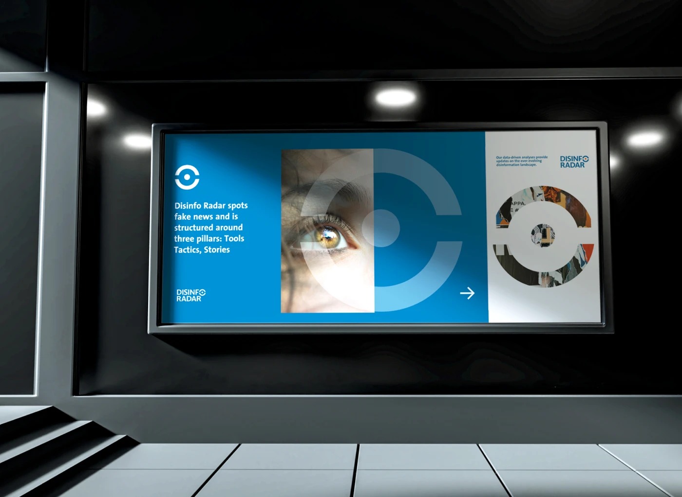
Disinfo Radar screen billboard — the symbol used as an image container over a human eye, with the three-pillar message beside it
The symbol as a container
The ring opens up and holds imagery — here, an eye.
05 — The Results

An identity the team took further on their own.

A logo and standalone symbol with full-colour, monochrome and reversed versions, minimum sizes, and dedicated crops for square and circular social profiles
Three pillar sub-marks — Tools, Stories, Tactics — generated by one rule: rotate the axis, flip the colours
A complete guideline book: colour system, TheSans / Neuzeit Grotesk typography, A4 layout grid, business stationery and don'ts
Applications across report covers, social templates, posters, merchandise and event screens

The team was very happy with the result, and they took it further on their own. When they built disinforadar.com, they started from the concept as I presented it: on the live site, the symbol continuously emits waves around itself — permanently in motion, monitoring. The same idea the mark started from, now running in public.

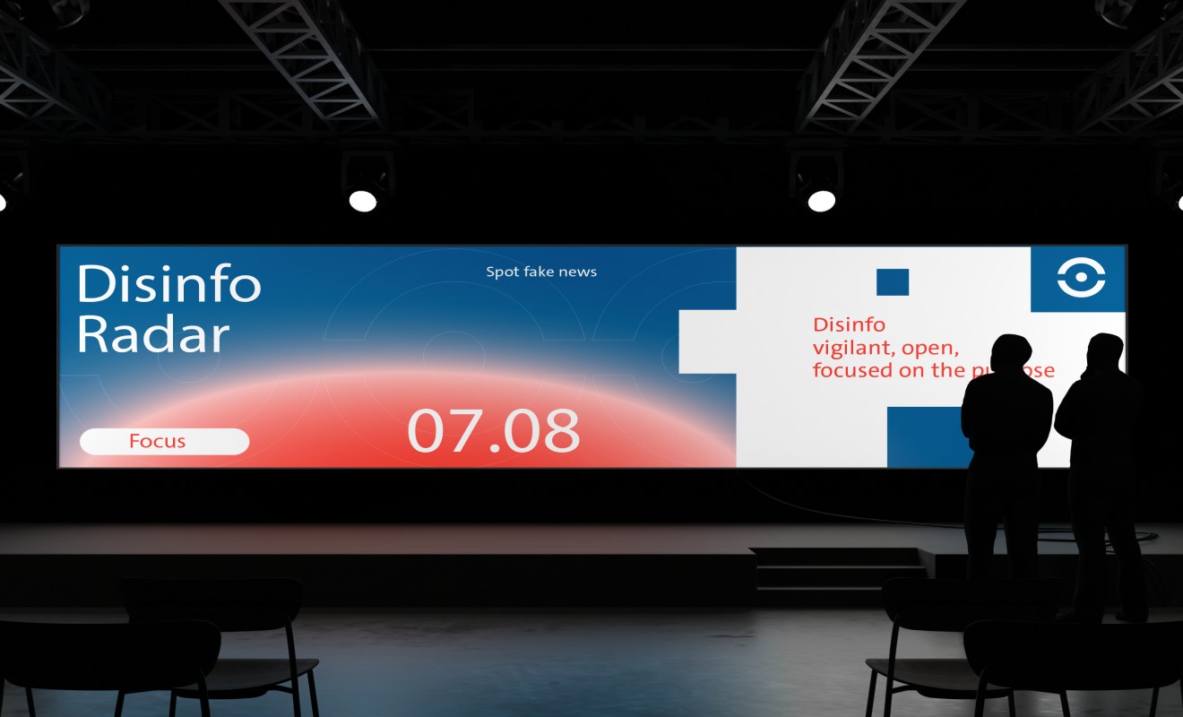
Disinfo Radar identity on a wide event stage screen — Spot fake news, with the radar wave motif glowing behind the wordmark
On stage
"Vigilant, open, focused on the purpose" — the identity at event scale.

Disinfo Radar doesn't watch one direction — it scans through three. The mark had to do the same: a radar that is always on.

— The analogy the whole system runs on
More Work

Two more decisions, two more systems.

Have a mission that's hard to make visible?
Let's build the system

I take on a small number of strategy & identity engagements for companies in fintech, medtech and civic tech.